Totchi is the world's first comprehensive emotional wellbeing platform designed specifically for children. They're shifting from scattered, problem-focused mental health tools to a joyful, growth-oriented companion that turns every feeling into an adventure.


The children's mental health space is dominated by "calming and soothing" brands that focus on fixing problems rather than fostering growth. There's a massive white space for a brand that makes emotional learning feel like the most exciting adventure ever - optimistic, curious, and empowering rather than clinical or reactive. Totchi needed to carve out an identity that could own this space. It couldn't be typical or obvious that this was a children's brand, it had to evoke a feeling, rather than being completely literal.


Children's brands are usually presented through whimsical illustration and imagery of children. We wanted to combat that so we came up with the Brands core Idea as "Optimism to explore". Shaping feelings as an adventure waiting to happen. Rather than presenting the brand as the solution, we encourage users to explore their feelings through curiosity and imagination.


We created a Brand World that Totchi lives inside. An immersive, interactive space where children can explore their feelings. Nothing literal, no images of happy smiling children, no obvious illustration. A world left to the imagination. We created Orbs that represent the feelings children go through, they can interact with each other, guiding users throughout the brand — reinforcing the brands idea of optimism to explore.


Totchi is now equipped with an identity that doesn't box them into any given subject or feeling. It allows the brand to scale and expand into different areas as it grows. It invites it's target audience to come and explore the brand without feeling like this is another fix. The brands system looks big and adventerous, but it's simply designed to scale across the website, the app and social easily. Go check them out!


We were introduced to Frankie through a friend who had previously worked with him on their own brand. After speaking with several designers, it became clear from our very first conversation that Frankie was the right fit for us.
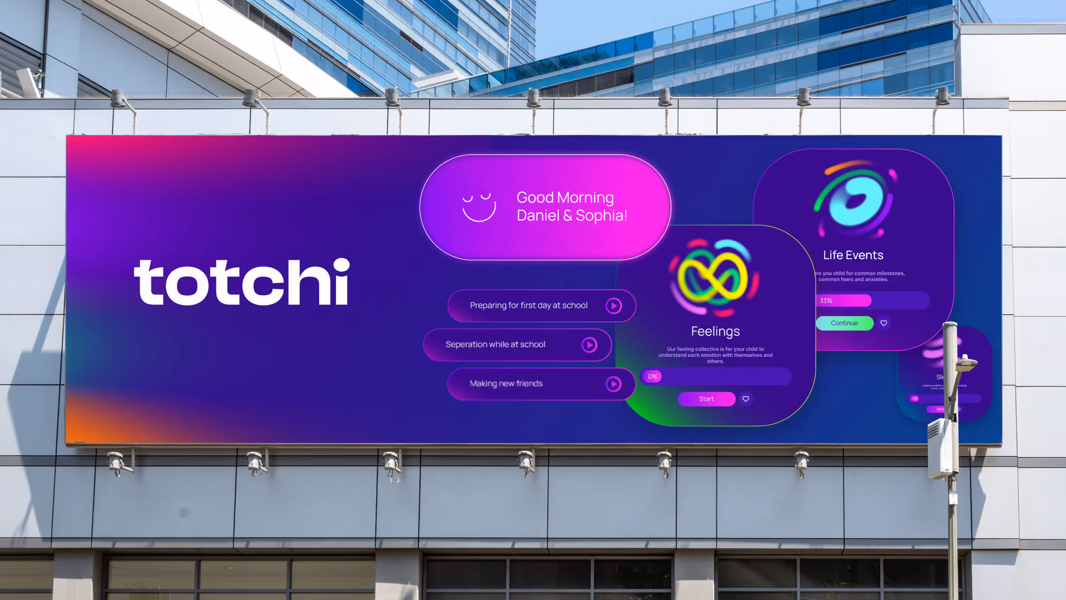
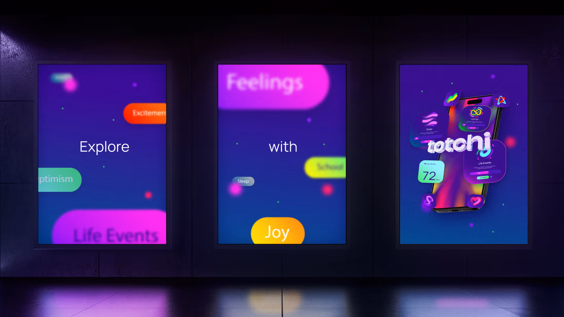
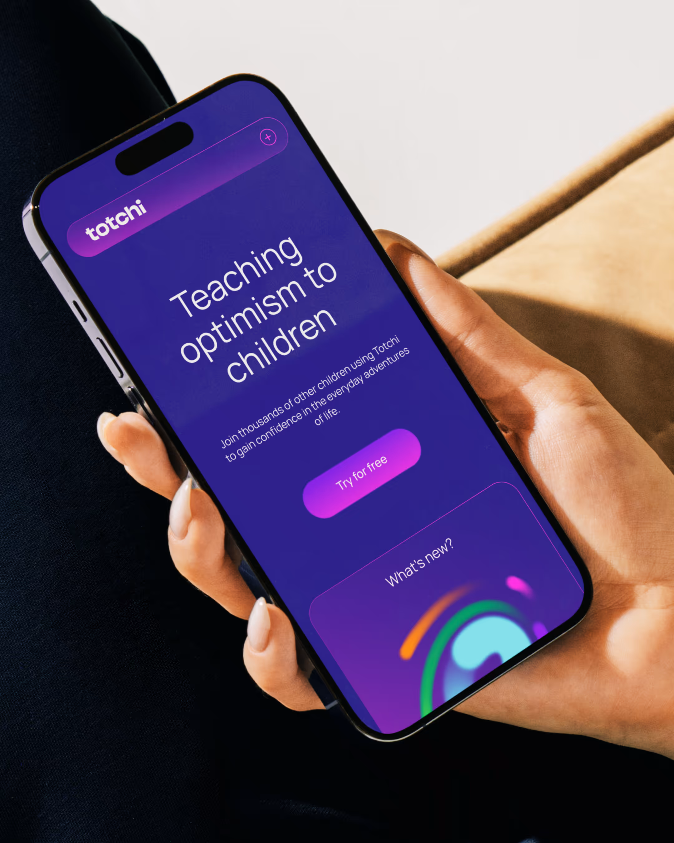
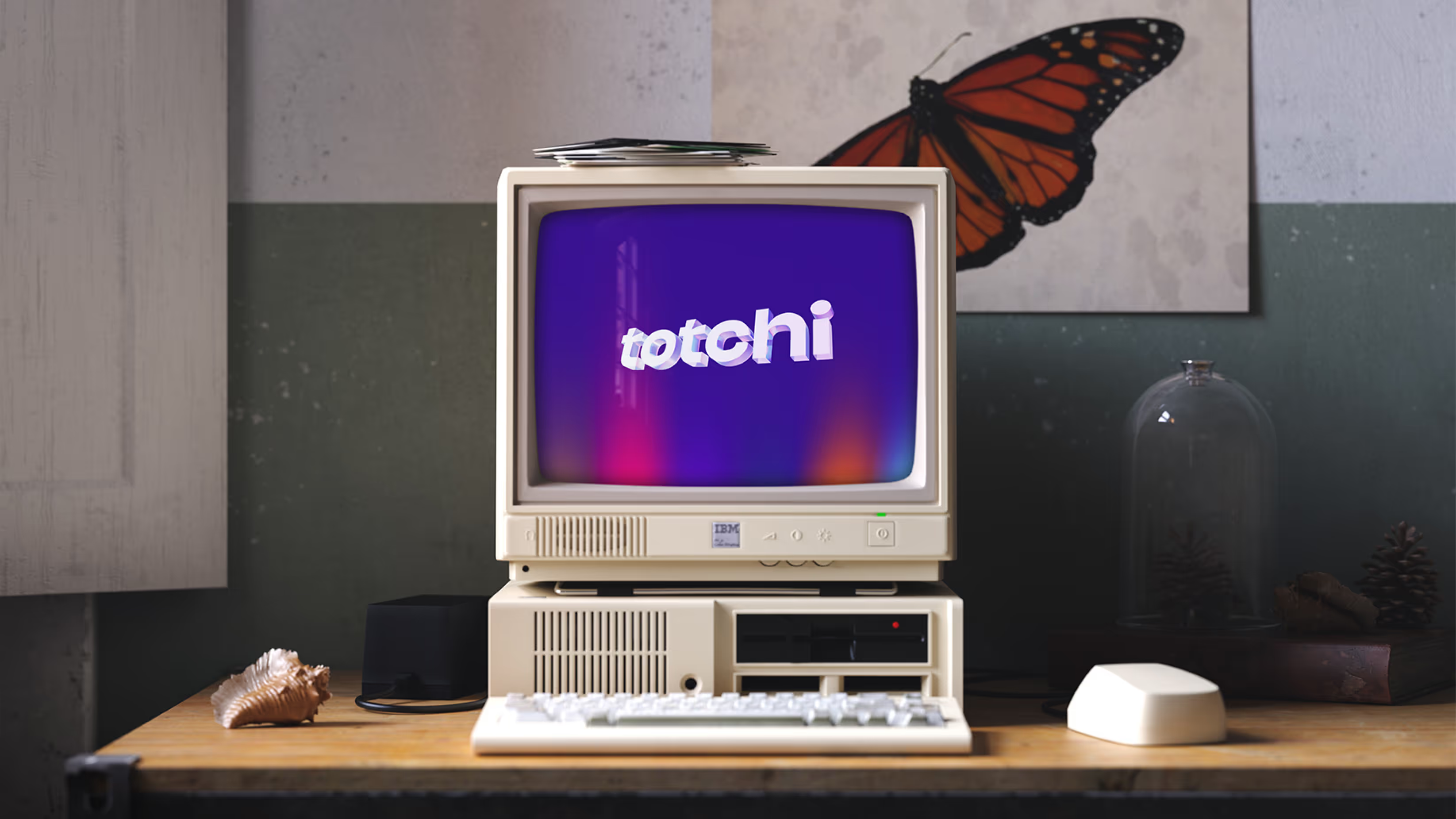
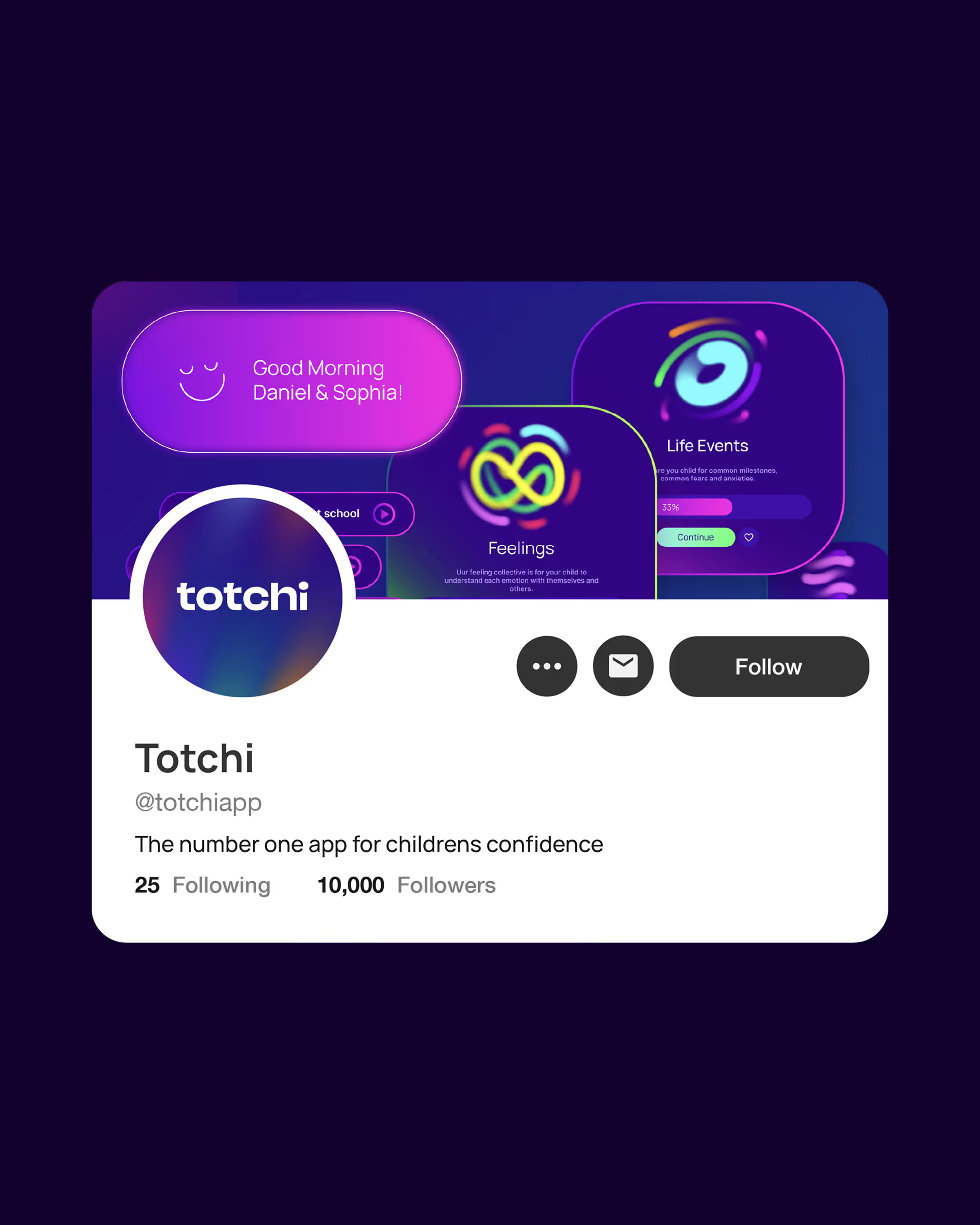
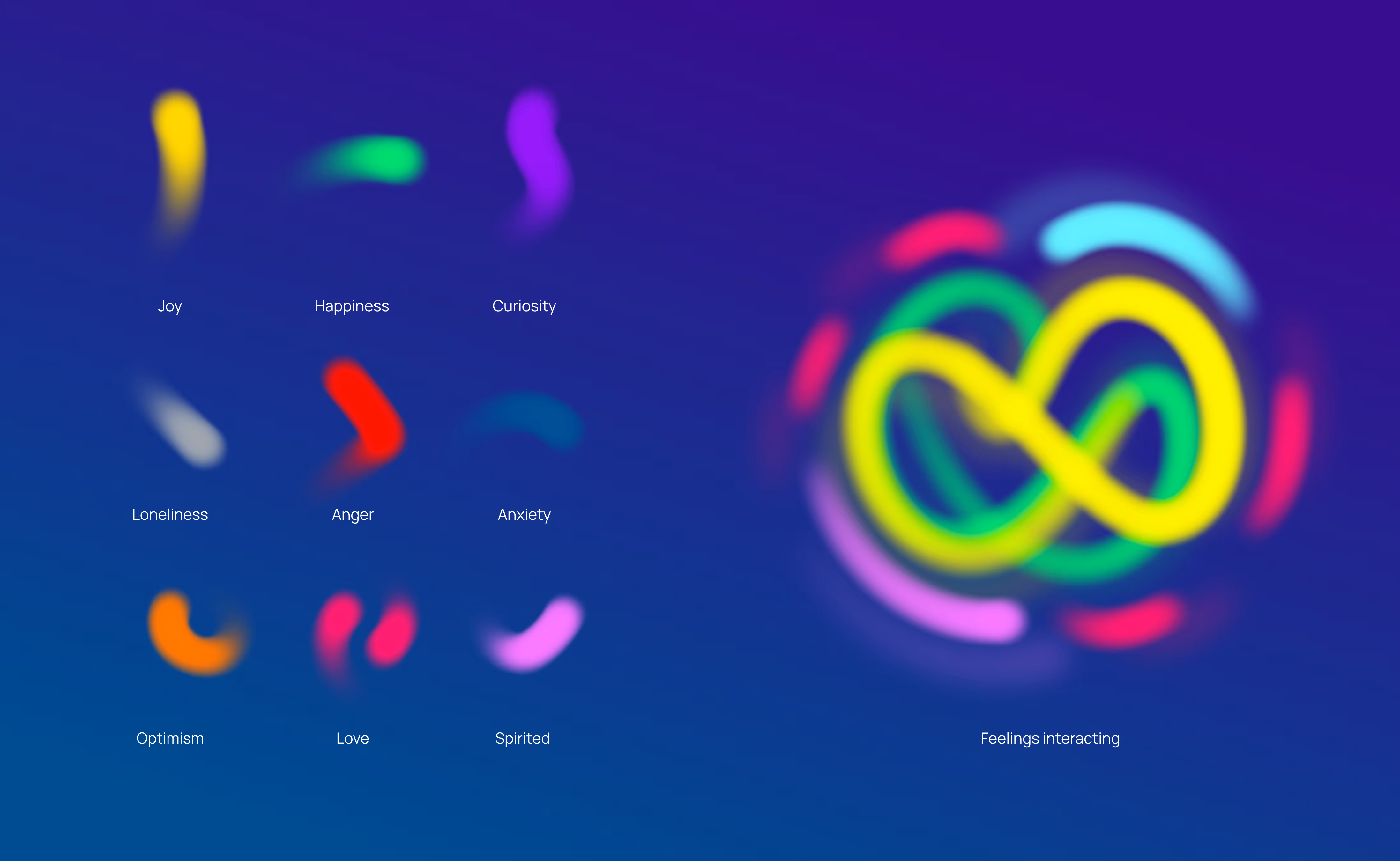
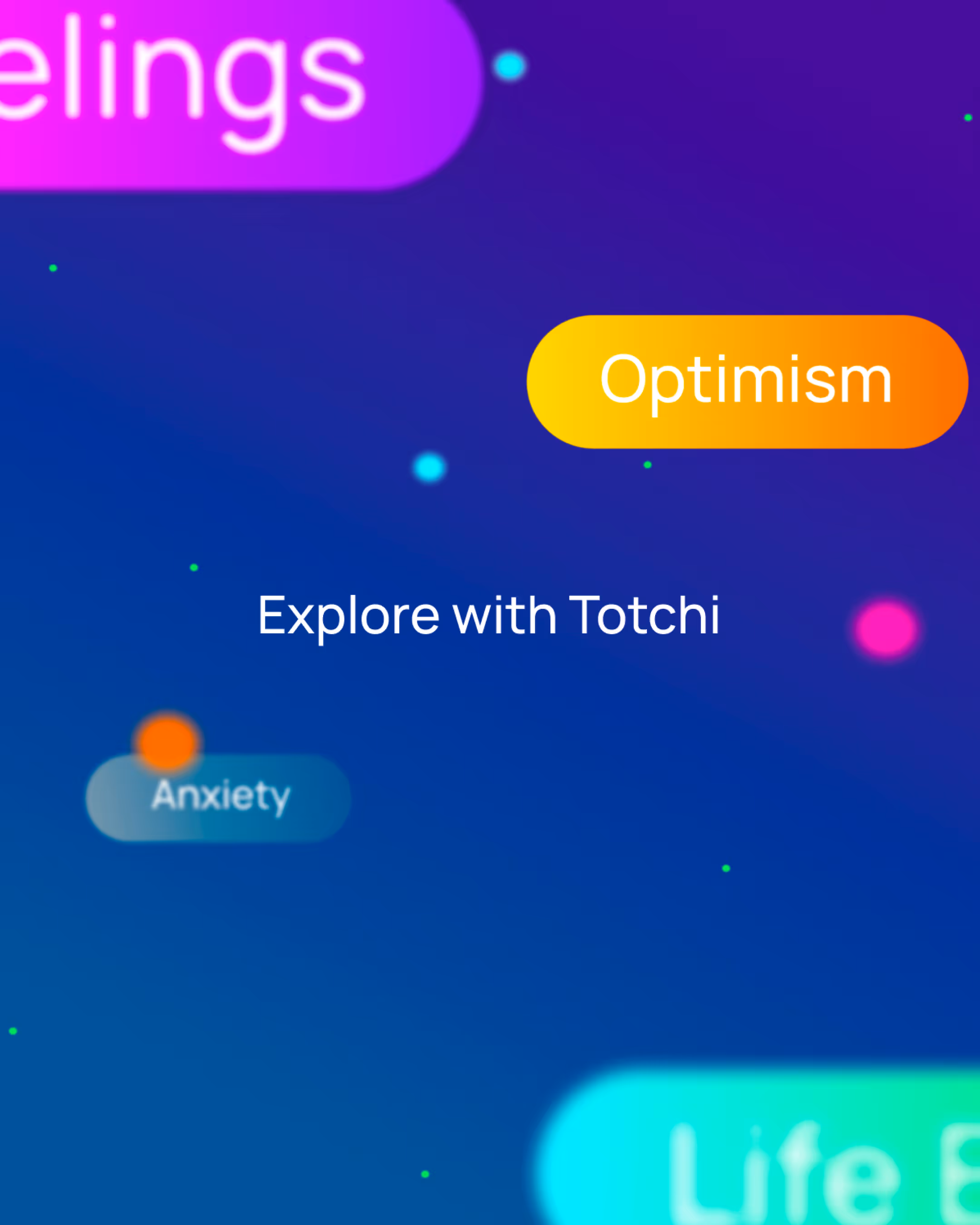
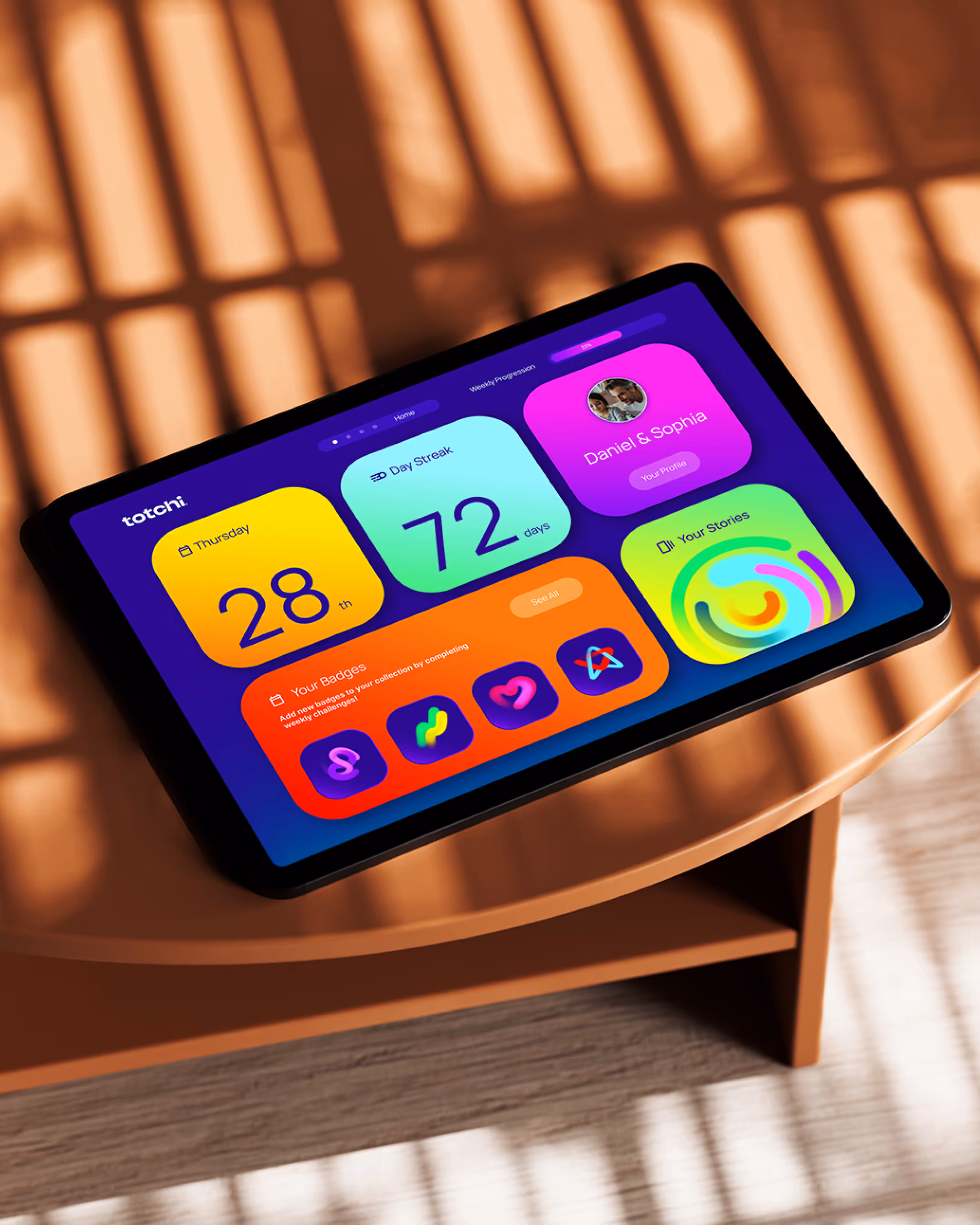
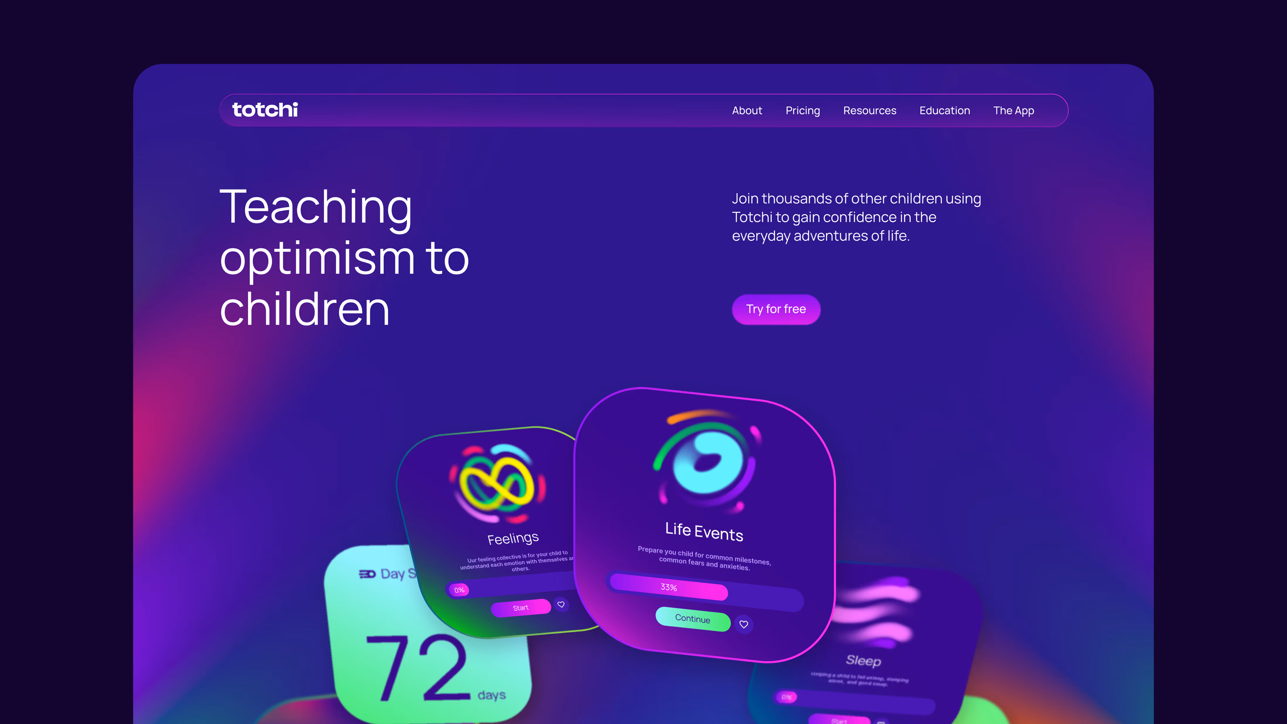
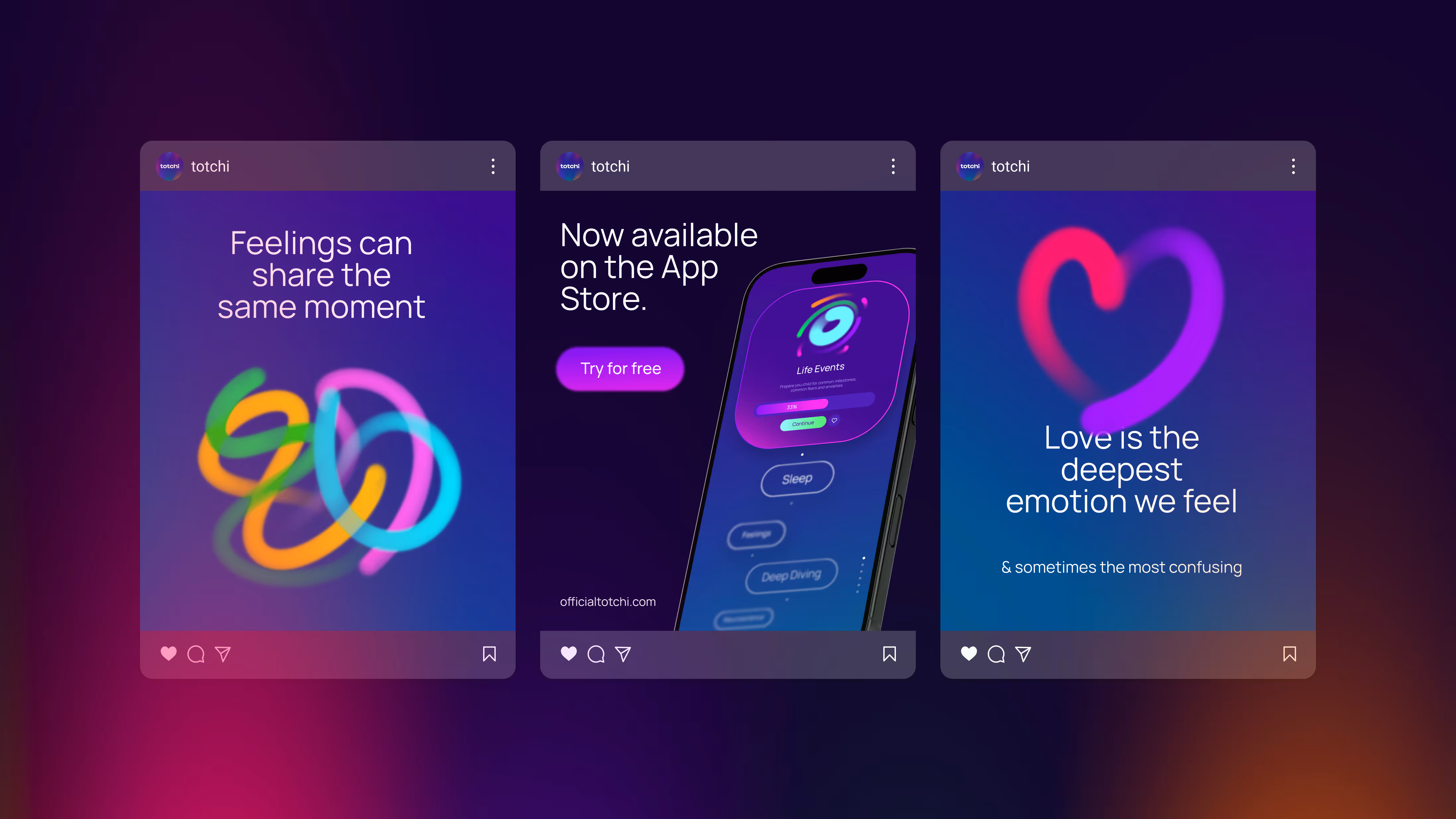
Our mission is complex, with many layers to consider. Totchi (Teaching Optimism To Children Independently) is an audio storytelling app designed to help children understand their emotions and feelings—not to “fix” broken children, but to empower all children with optimism. We needed a brand that could feel fun and engaging for young users, while still appearing sharp and credible in the corporate world, all within a space that hasn’t really been explored before.
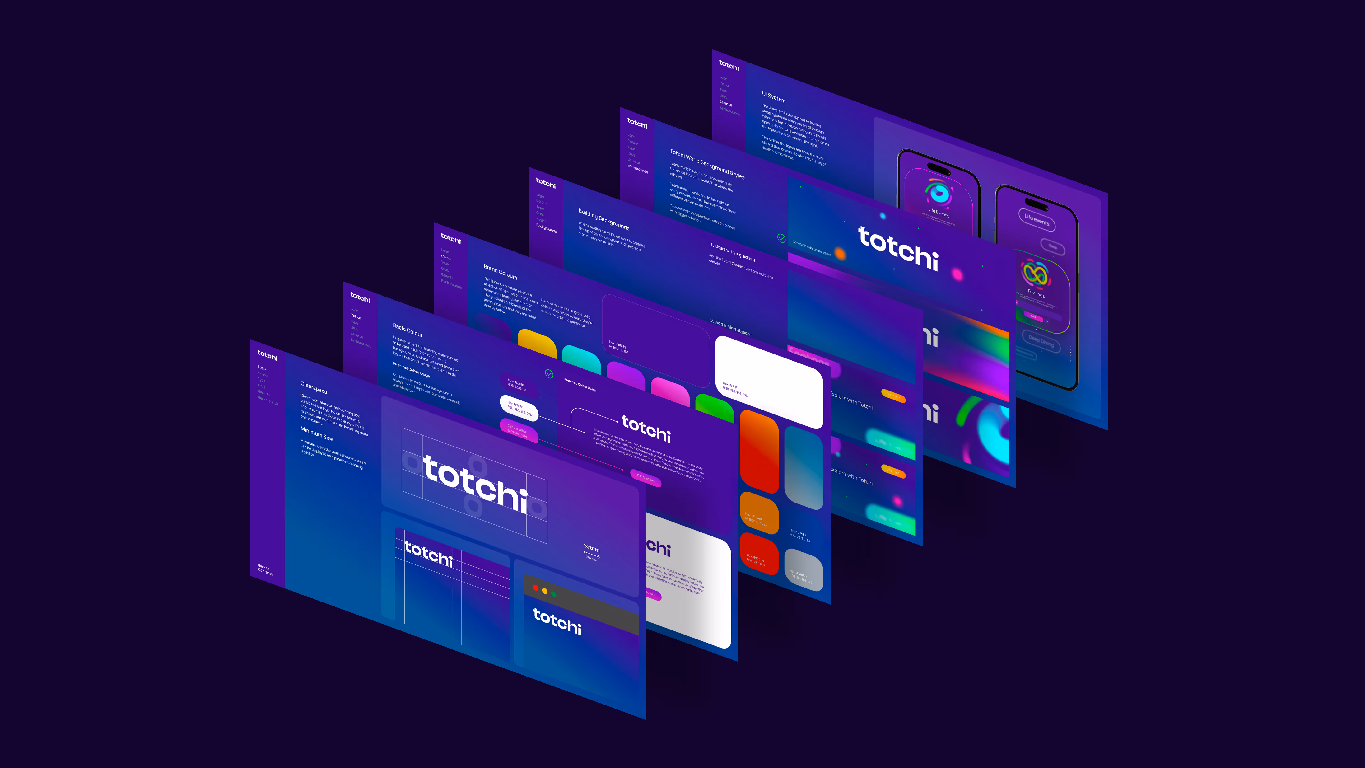
Frankie initially presented two strong creative directions. While both aligned well with our educational goals, they didn’t quite capture the full essence of who we are. What stood out most was Frankie’s response—rather than settling, he took the time to go deeper. He made a genuine effort to understand not just our brief, but how we feel about our business and what truly matters to us.
He brought his own creativity, personal experiences, and even insights from his own children into shaping Totchi’s brand. When he presented the final concept, we were genuinely blown away.
Frankie showed incredible resilience, patience, and determination throughout the process. He didn’t just want to showcase his creative ability—he wanted to do justice to our vision. His ability to connect emotionally and translate that into his work is what truly sets him apart.
Frankie isn’t just a designer—he’s a creative partner who deeply understands the importance of building something meaningful.