Cart(0)
0

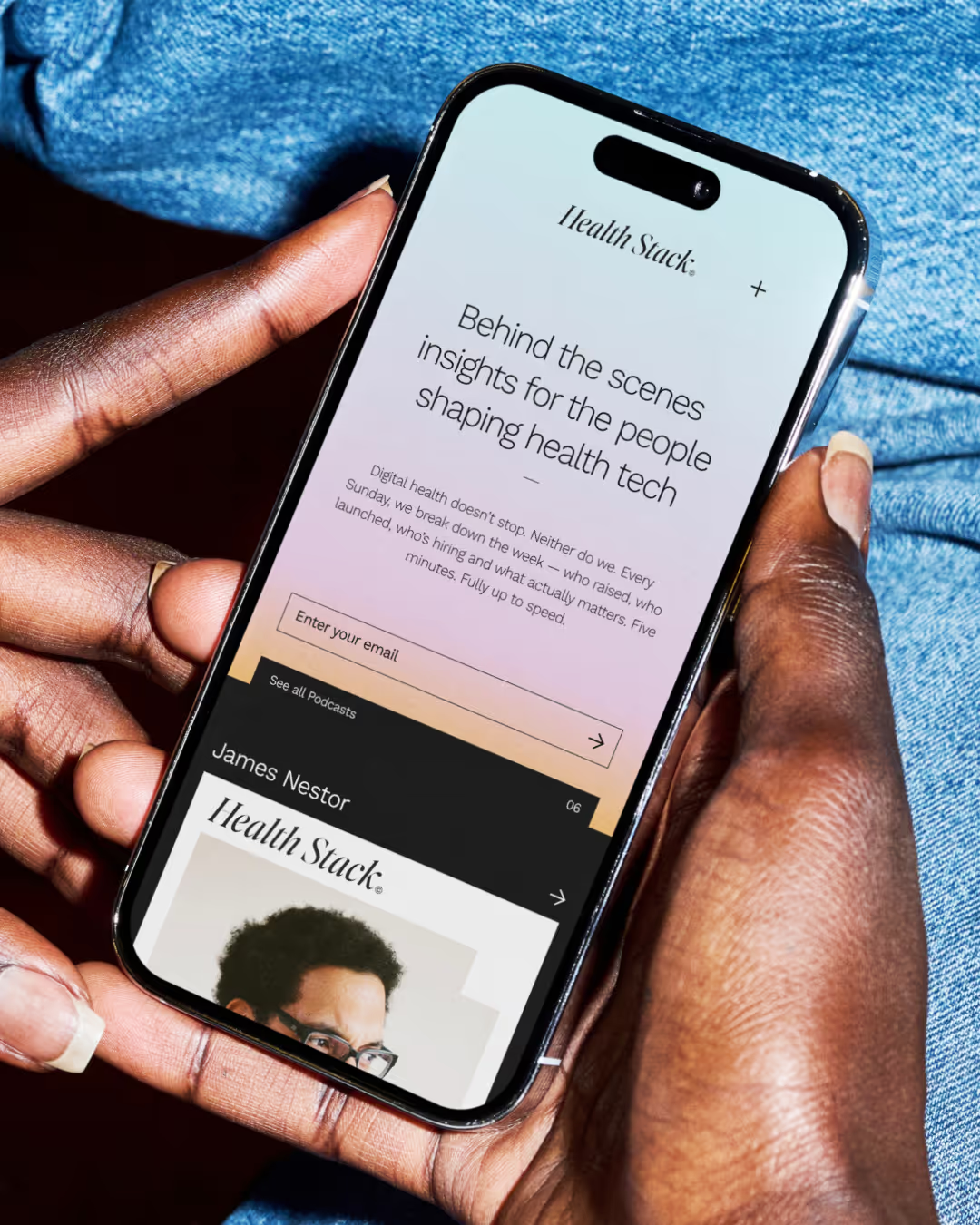
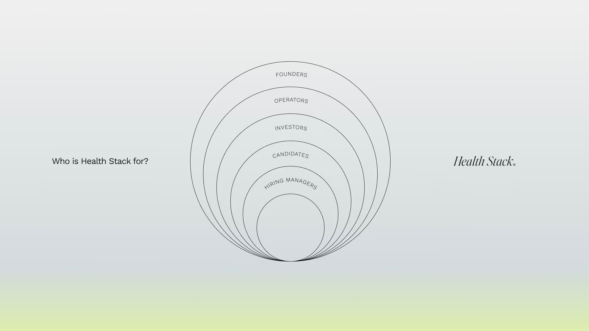
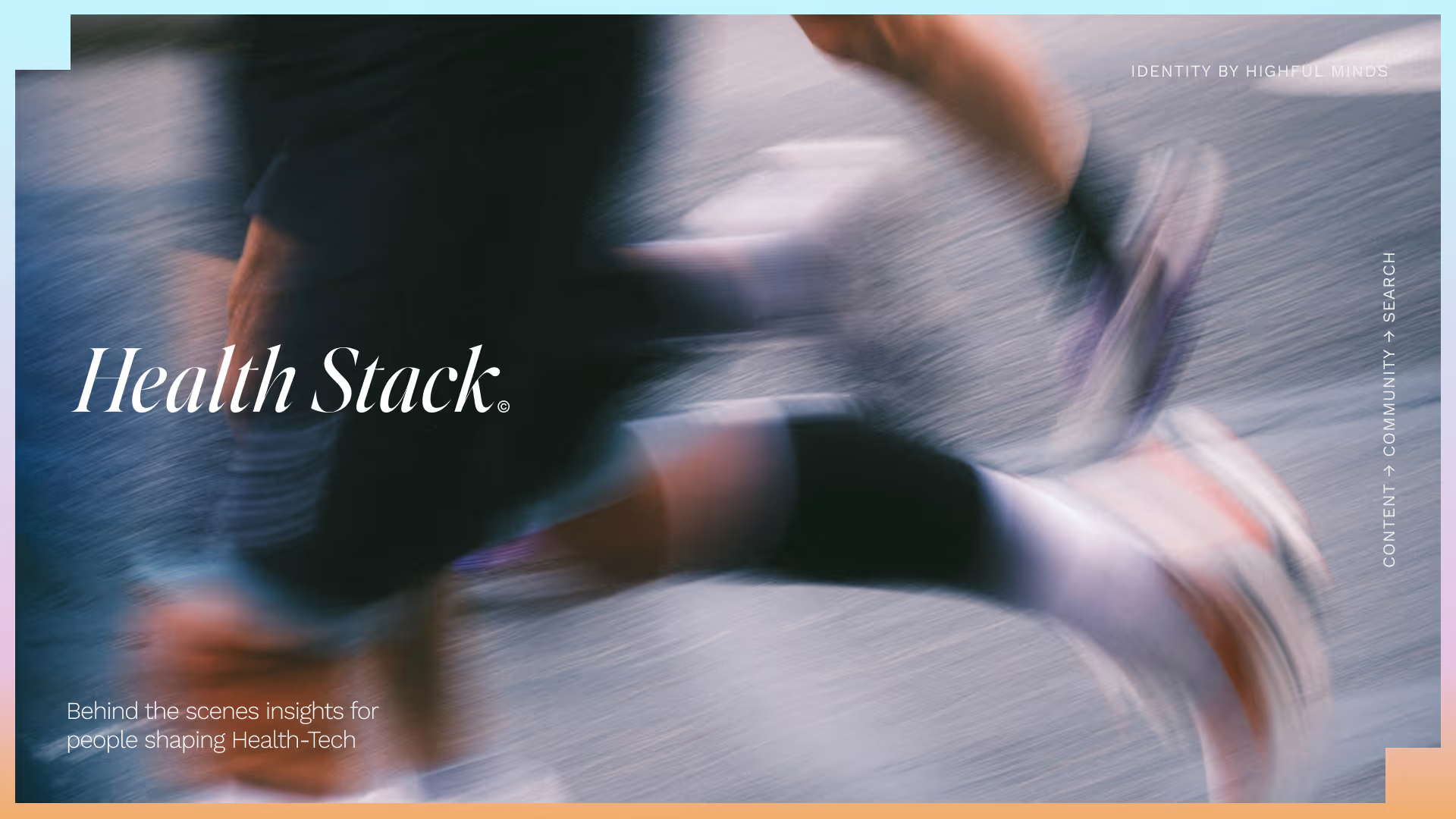
Health Stack is a Podcast, Newsletter and all round news that exists to give founders, operators and investors who are building in digital health access to the tools, knowledge and people that enable them to thrive.

Health Stack

Year

2026

Services

Visual Identity
Brand Style Guide
Website

Health Stack is a Podcast, Newsletter and all round news that exists to give founders, operators and investors who are building in digital health access to the tools, knowledge and people that enable them to thrive.

Credits

Designer
Frankie Harry
Web Design + Develop
Lee Holmes
(
)

No items found.

Testimonial

No items found.
(
01
)

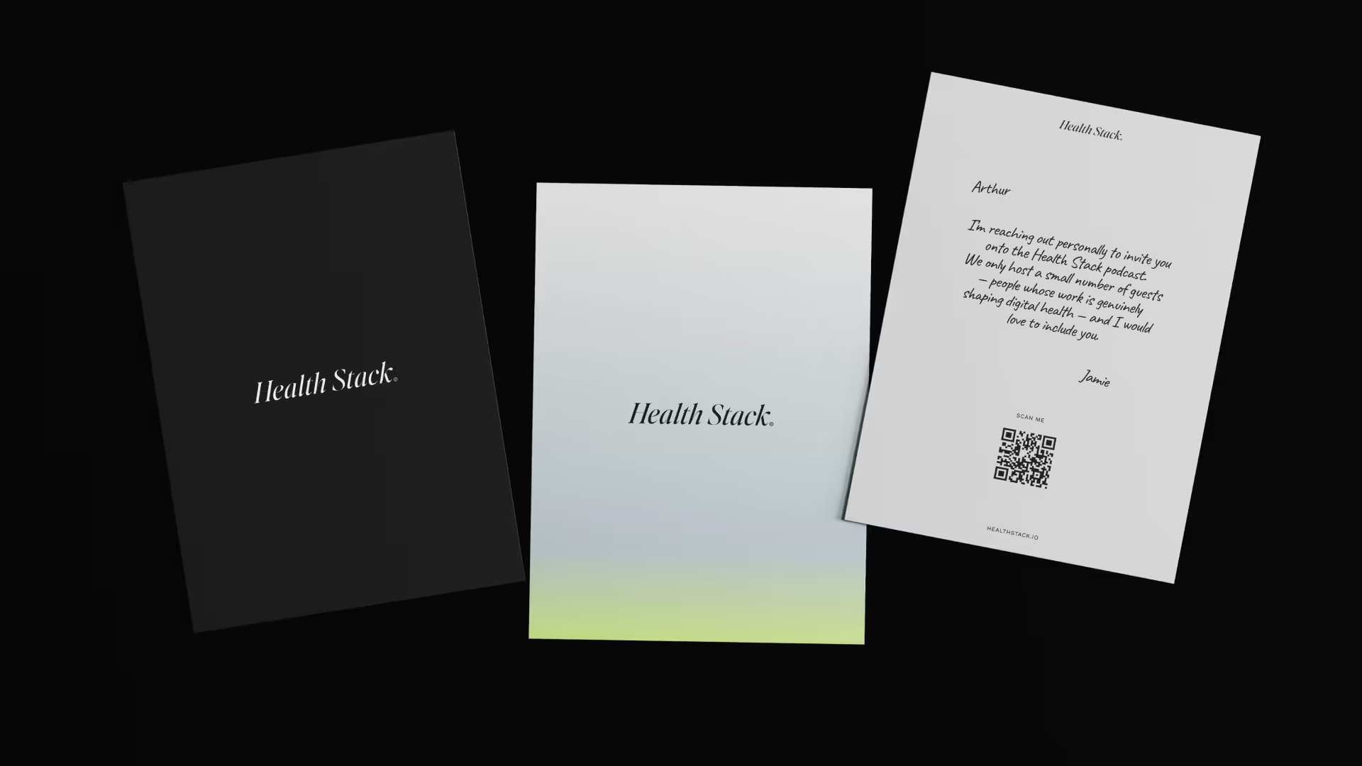
Health Stack was a particularly great project for us, it completely switched up the way we normally work. Jamie, the founder, needed a Brand Identity to Launch Health Stack alongside it's podcast release... which was in 2 weeks. We created two visual directions for how Health Stack could look. Number one being a very "now" look -- Modern, clean, tech forward and dare I say a little sterile. While it absolutely would work for Health Stack. I as a designer wanted to present Jamie with a second direction that felt way more ownable. Thankfully, he chose the second direction which you see here.

The Project

No items found.

Testimonial

No items found.
(
)

No items found.

Testimonial

No items found.
(
02
)

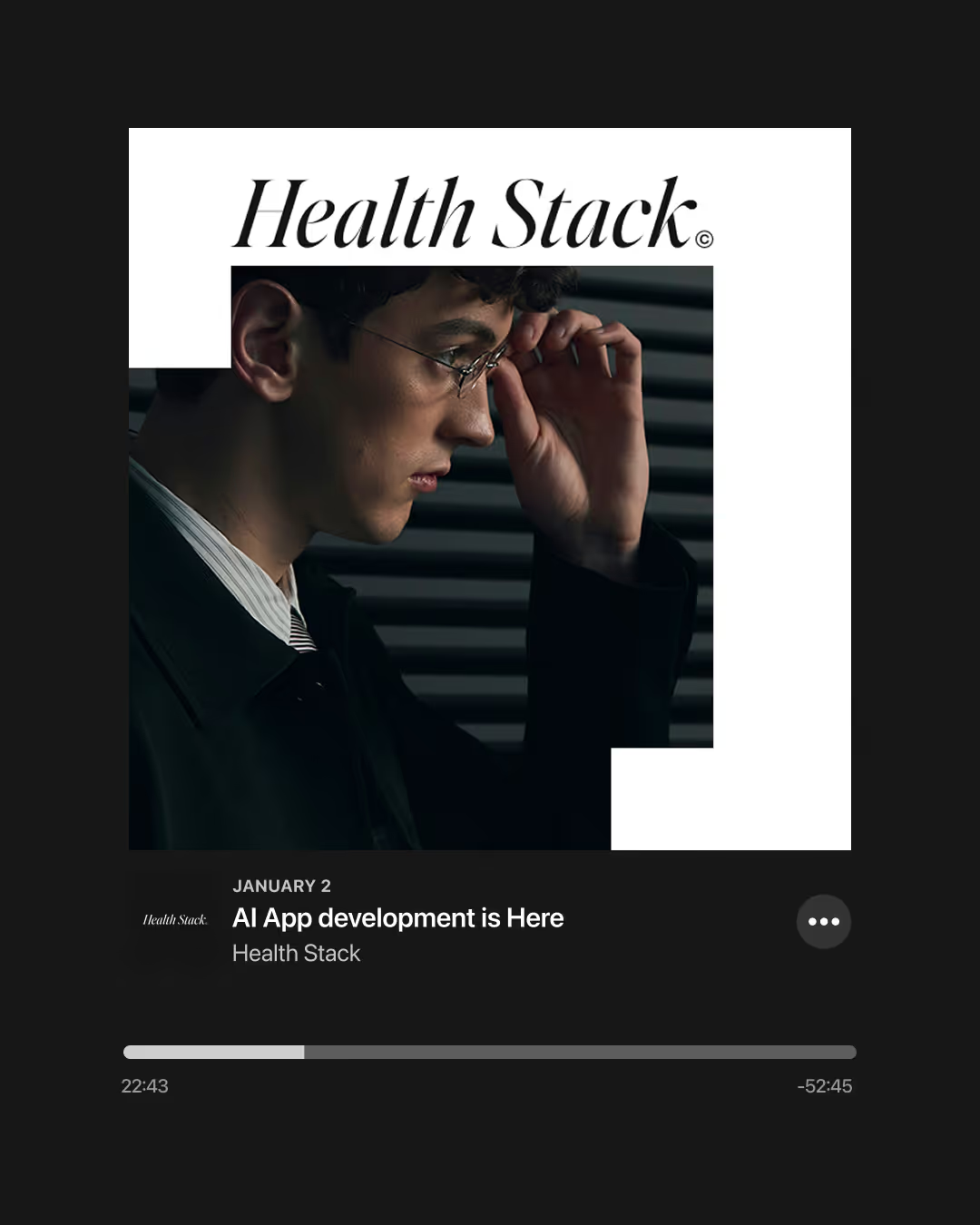
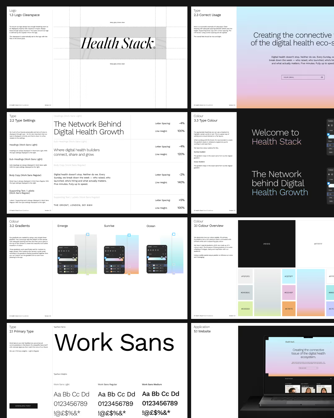
We opted for this absolutely stunning delicate Serif from Jeg Wagner Type - Editors Note Display. Health Stack is all about delivering high quality conversations and news from the latest in Health Tech. It had to feel credible and trustworthy to it's audience in that industry. No other Tech News brands are using Serifs like this, they all fall into the clean sans serif grotesque wordmarks, I wanted to stay away from that, and really position Health Stack as something completely independant and ownable.

The logo will be the first thing it's audience will see when encountering the brand, and also the last thing they remember. We wanted to make the logo memorable. Time will tell, but I'm certain people will remember this wordmark as the pinnacle of quality health tech news.

The Logo

No items found.

Testimonial

No items found.
(
)

No items found.

Testimonial

No items found.
(
)

No items found.

Testimonial

No items found.
(
)

No items found.

Testimonial

No items found.
(
03
)

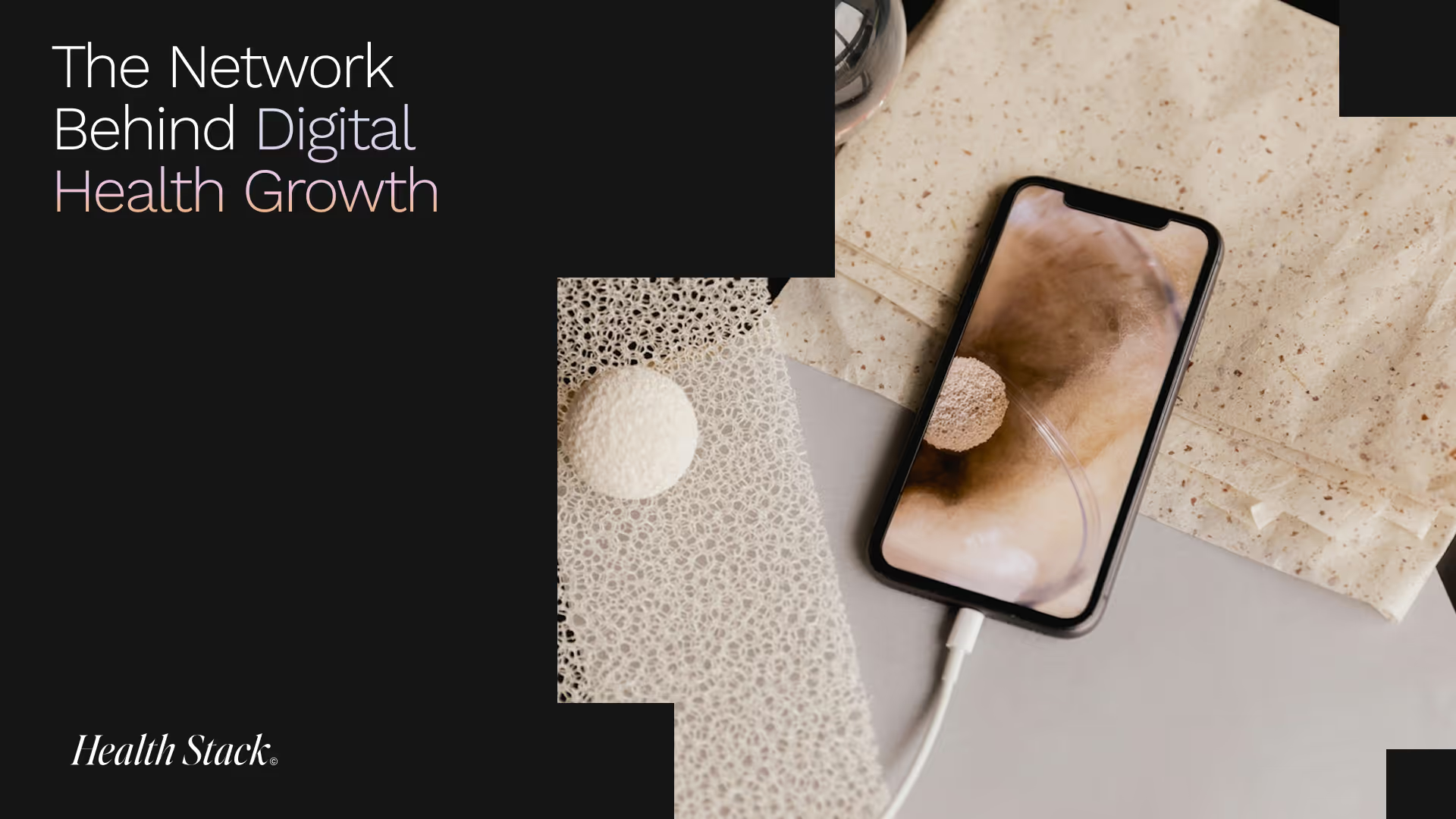
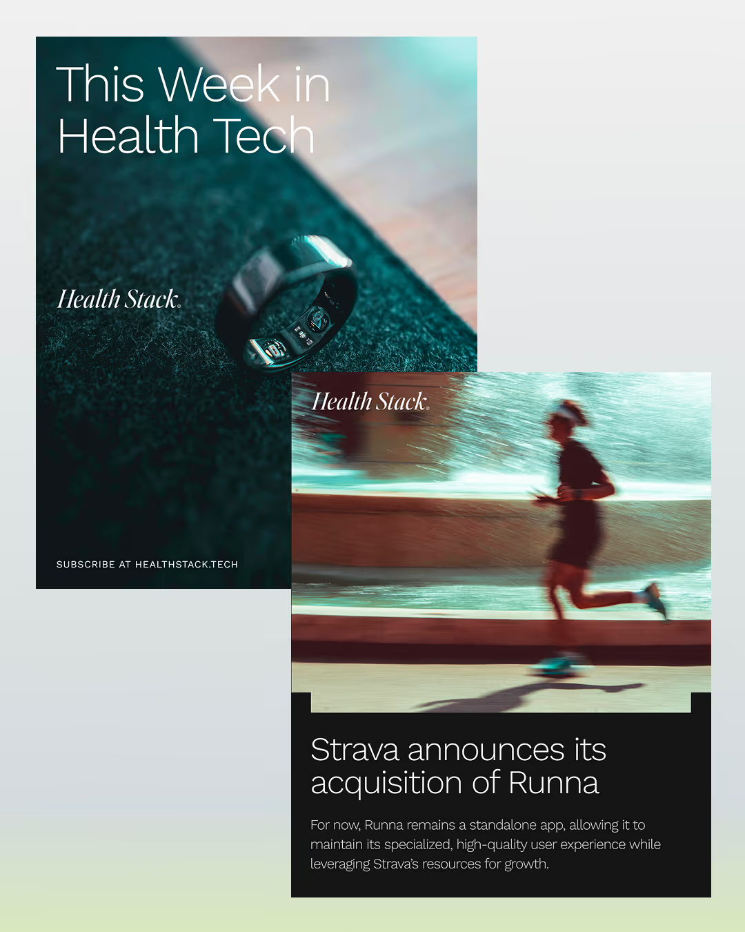
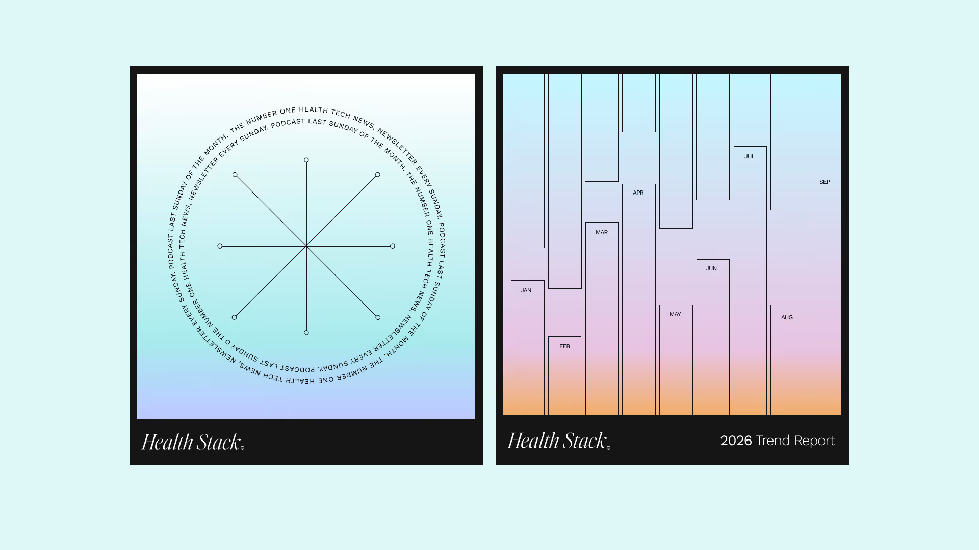
The tech industry can feel quite cold - monochrome colours, purple and grey gradients and what not. Ultimately, we wanted Health Stack to feel warm and human. While exploring different palettes for the Brand,  I stumbled upon a few hues that made an emotion in me really stand out. The stepped Sunrise gradient was the first we chose, it complimented the identity we was building so well. Then Ocean came along, a perfect compliment to Sunrise. Then we chose the green and grey as a third and final. These colours add a lot of warmth and emotion to the brand, and that's exactly what we need when trying to build an audience in the saturated Tech space.

Colour thats Human

No items found.

Testimonial

No items found.
(
)

No items found.

Testimonial

No items found.
(
)

No items found.

Testimonial

No items found.
(
)

No items found.

Testimonial

Jamie Hearne
CEO of HealthStack

"I first saw Frankie's work about 6 months ago on a friend's startup. Then, by pure coincidence, I met him in a coaching program a few weeks later and knew we had to work together.

When we first spoke about HealthStack, I had a very high level idea for a content platform but no clear direction for its design.

Frankie took the lead and created a brand concept that moved in a totally different direction from anything I had considered - and it was better for it.

His creative mind has been the catalyst for my business growing into something much bigger - something I feel much more deeply connected to.

I can't recommend Frankie enough. I used to think design was just how nice something looked. I now realise it's much more than that - it's really how something makes you feel."

No items found.

More Projects(2)

View all