alto is a premium Alpine Experience Brand offering skii expeditions and swiss lodges. It’s a meticulously designed immersion into alpine excellence. Helicopter arrivals, personalized itineraries, and secluded luxury lodges — every element tailored for those who live life above the line.


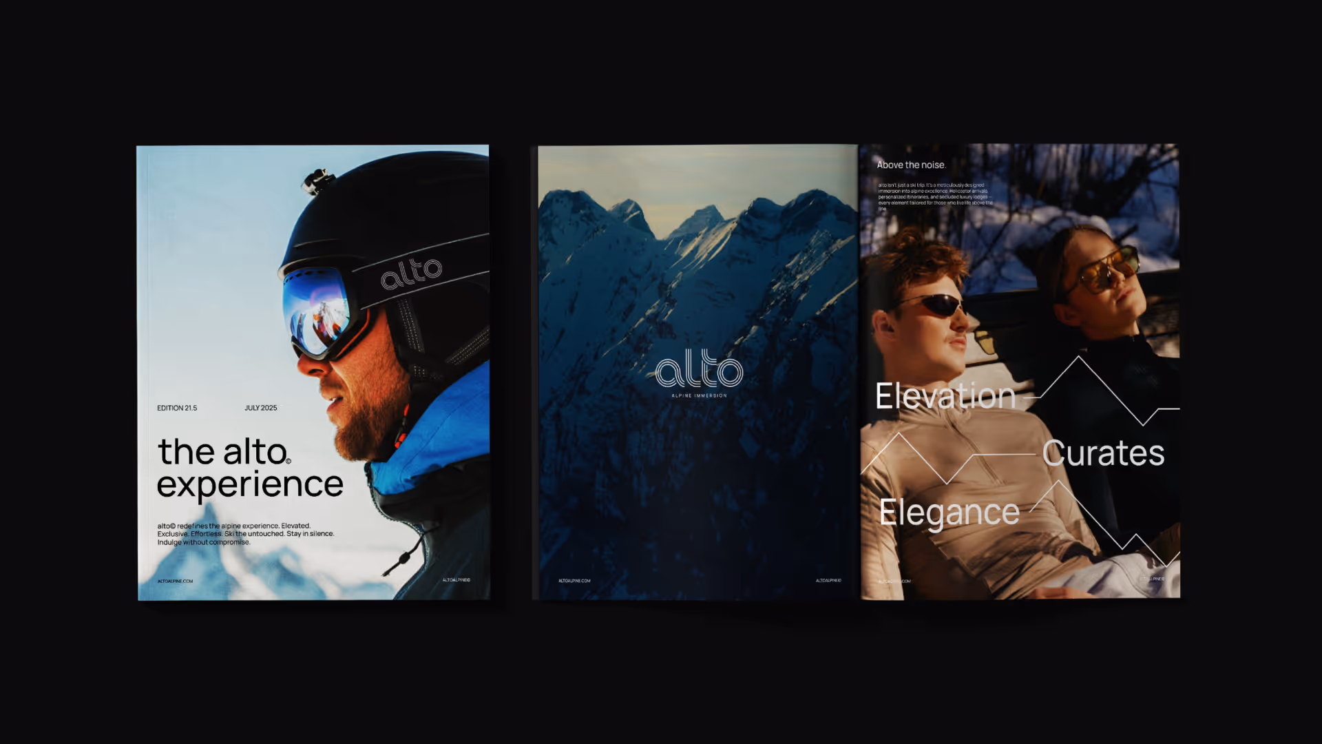
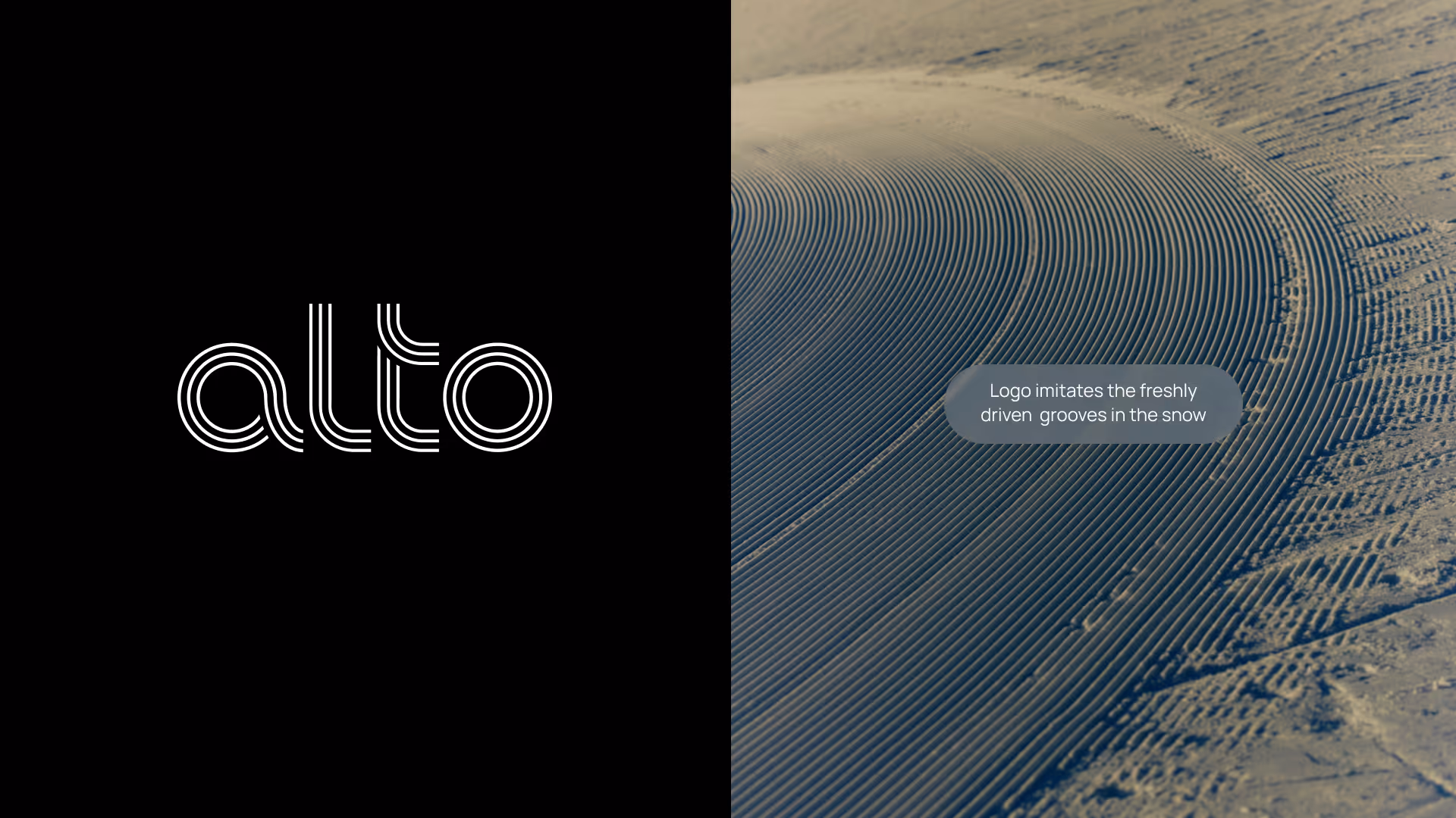
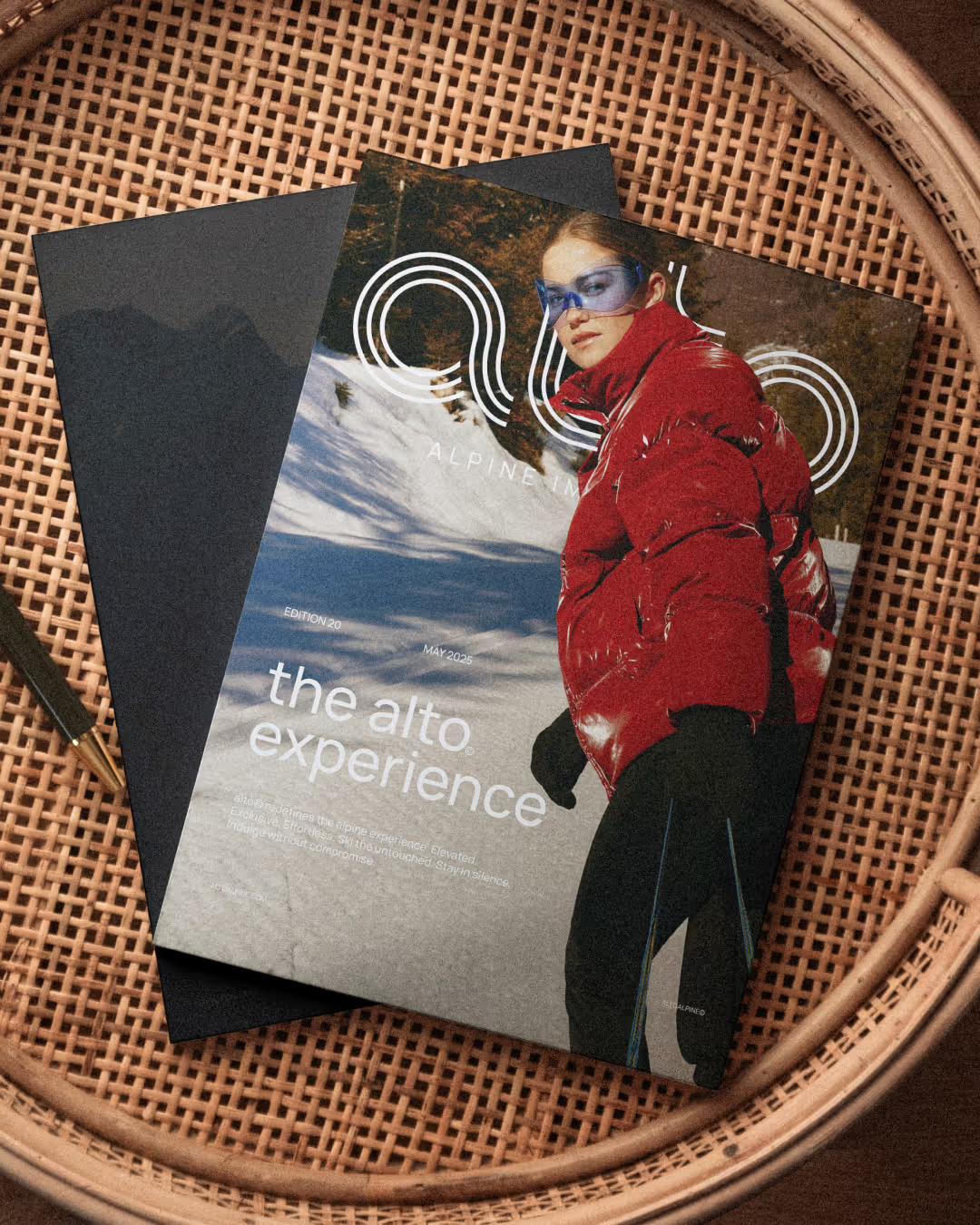
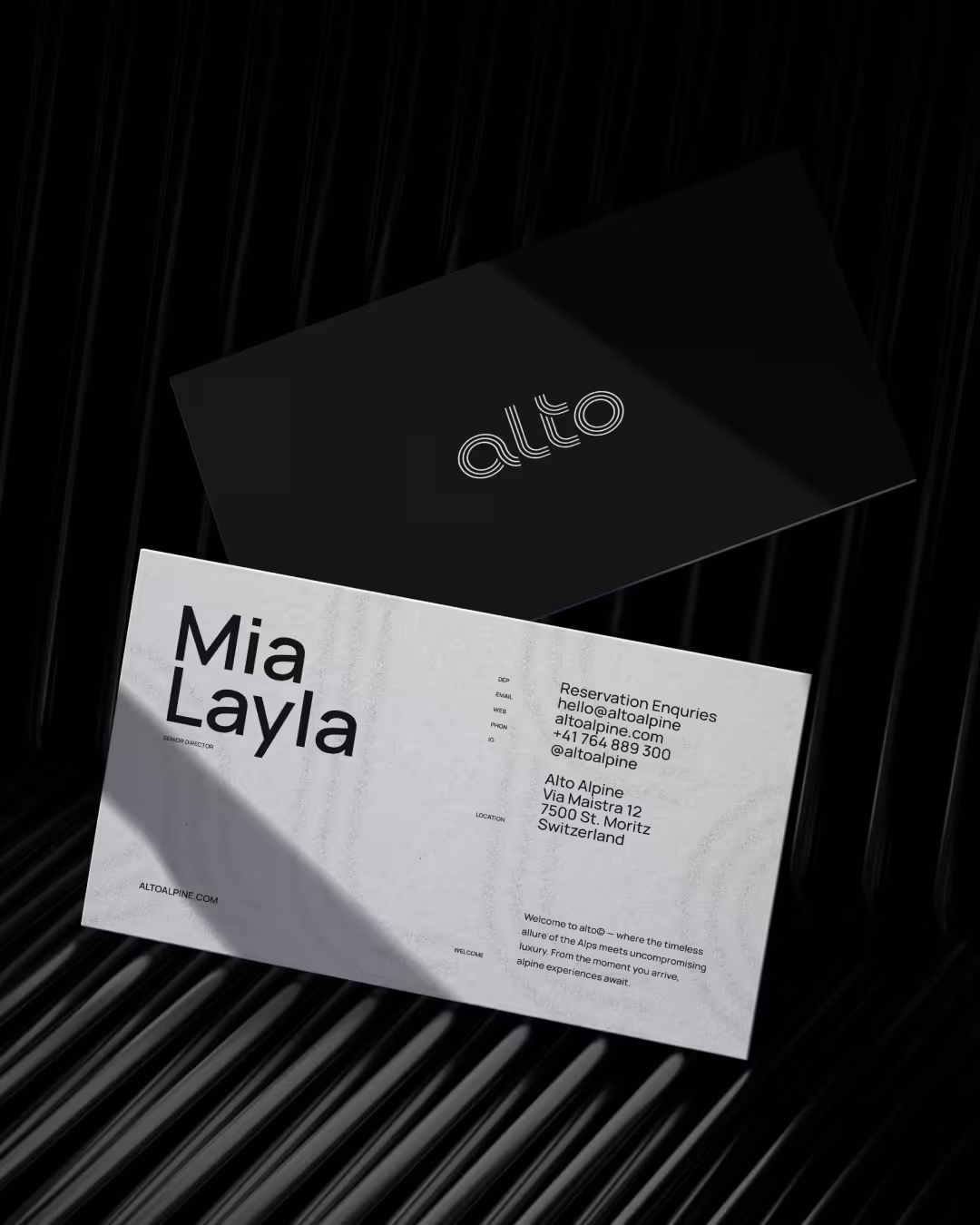
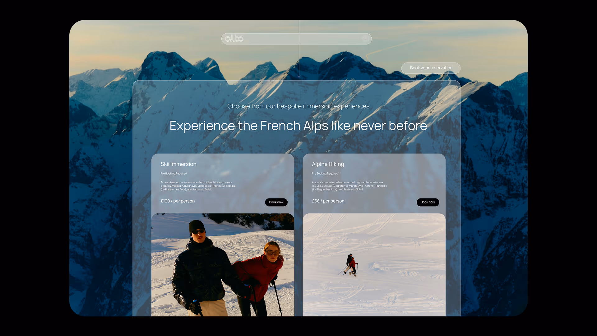
For the alto logo, it had to feel premium and have links back to its heritage ski experience. A lot of Ski / Alpine brands always revert back to including imagery of mountains in their logos. Which if we're honest, is overdone and cliche, this is something we wanted to stay clear of as the brand is anything but cliche.
We looked at what makes the Skii Experience, and that's ultimately the skiing. We looked at the freshly driven snow underground and it leaves these beautiful parallel lines running alongside each other. We knew this was the idea to incorporate into our logo. We constructed this custom wordmark formed using parallel lines to imitate that.


Focusing heavily on art direction - The whole visual system is built to support the imagery, to let it breath. We wanted the typography and colour to also reflect this. Opting for a clean swiss sans serif, swiss layouts and a monochrome palette. We really bring birth to a brand that feels exactly what it would feel like being in the swiss alps on a luxury alpine experience. A feeling of clarity and elegance.


