Cart(0)
0

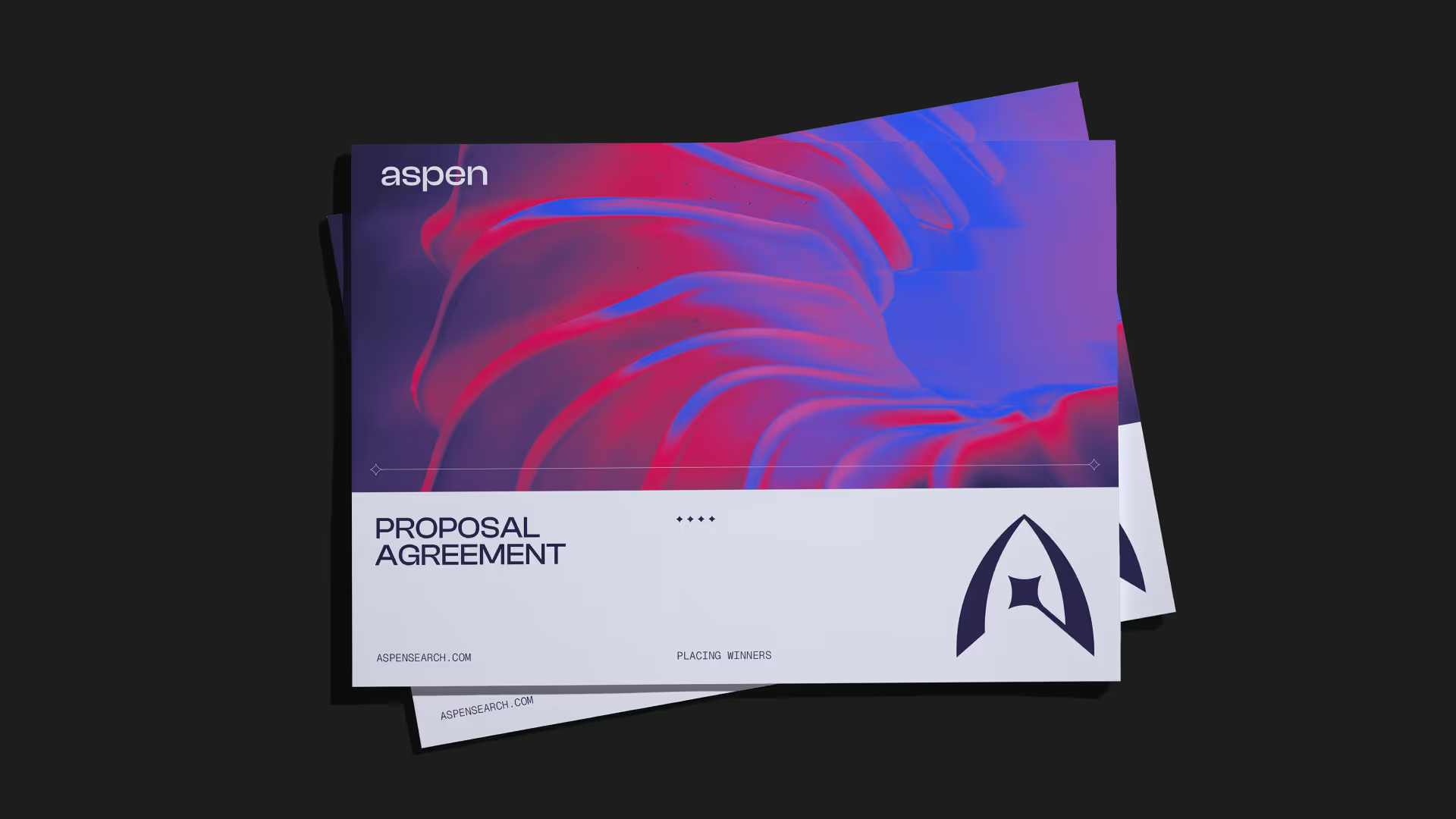
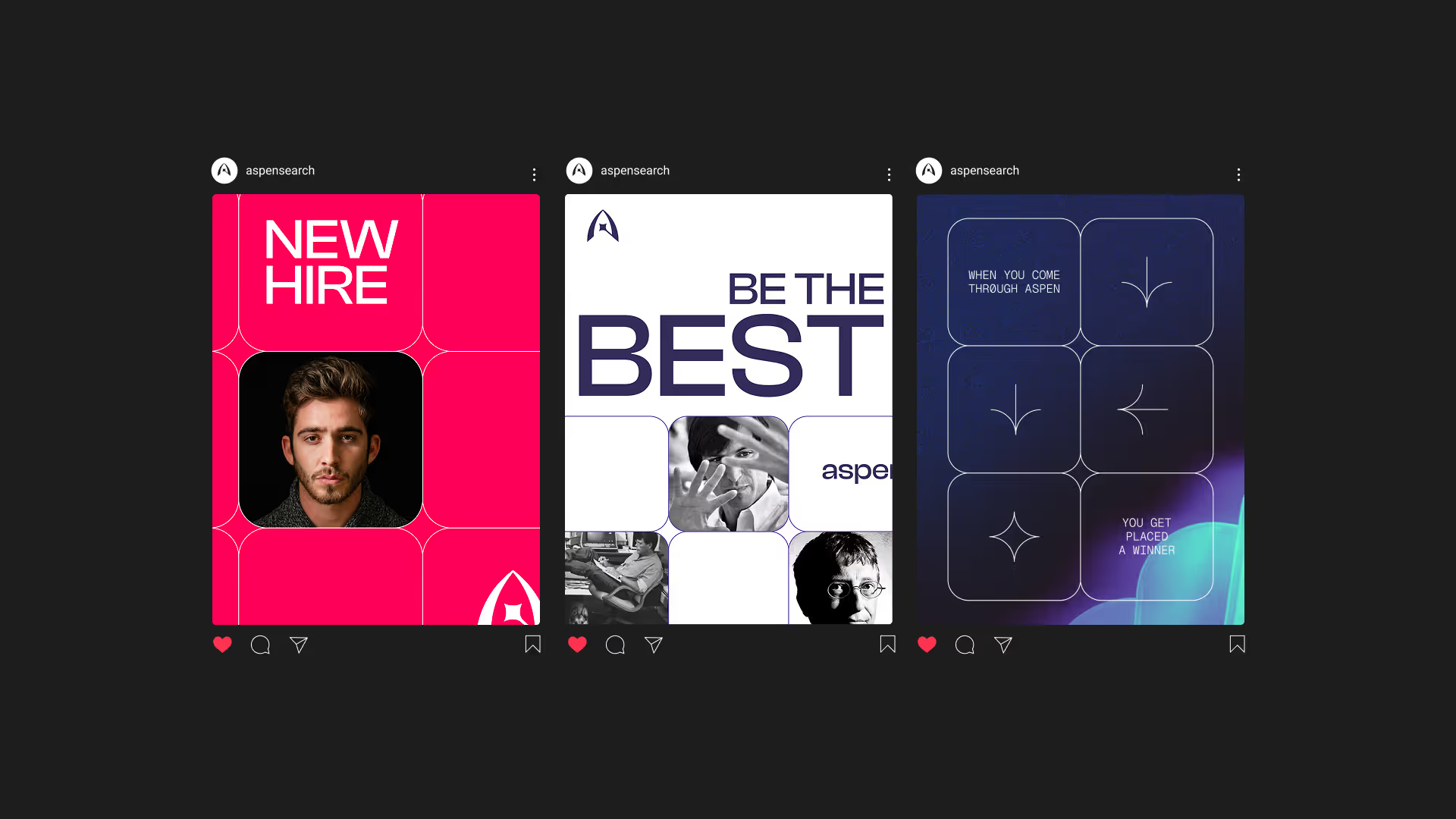
Aspen Search is a Boutique Recruitment firm that places the best talent in the roles of their lives. Specialising in Quant Trading and VC Backed startups, they're laser sharp at what they do. They wanted to position themselves as a bold challenger within their industry and they needed a new Identity to reflect just that. We got to work.

Aspen Search

Year

2025

Services

Brand Strategy
Logo Design
Visual Identity
Brand Style Guide

Aspen Search is a Boutique Recruitment firm that places the best talent in the roles of their lives. Specialising in Quant Trading and VC Backed startups, they're laser sharp at what they do. They wanted to position themselves as a bold challenger within their industry and they needed a new Identity to reflect just that. We got to work.

Credits

Designer
Frankie Harry
(
)

No items found.

Testimonial

No items found.
(
01
)

After the work we did for incentifi, I was approached by a fantastic chap called Ben Herman. Ben’s an an absolute powerhouse within his industry, recruitment. He runs a boutique recruitment firm that recruits to quant trading companies and VC backed startups, very techy I know. After me and Ben had a chat over the phone, I knew I had to work on this with him.

Ben slots perfectly into our ideal client zone. Driven, passionate, ambitious and is building his brand from a place of Purpose. He named his firm Aspen after his young daughter who very sadly passed away. He dedicated the work he does to make her proud and keep her living on. This was enough for me to know about the type of guy Ben is, and what he is building.

Introduction

No items found.

Testimonial

No items found.
(
)

No items found.

Testimonial

No items found.
(
02
)

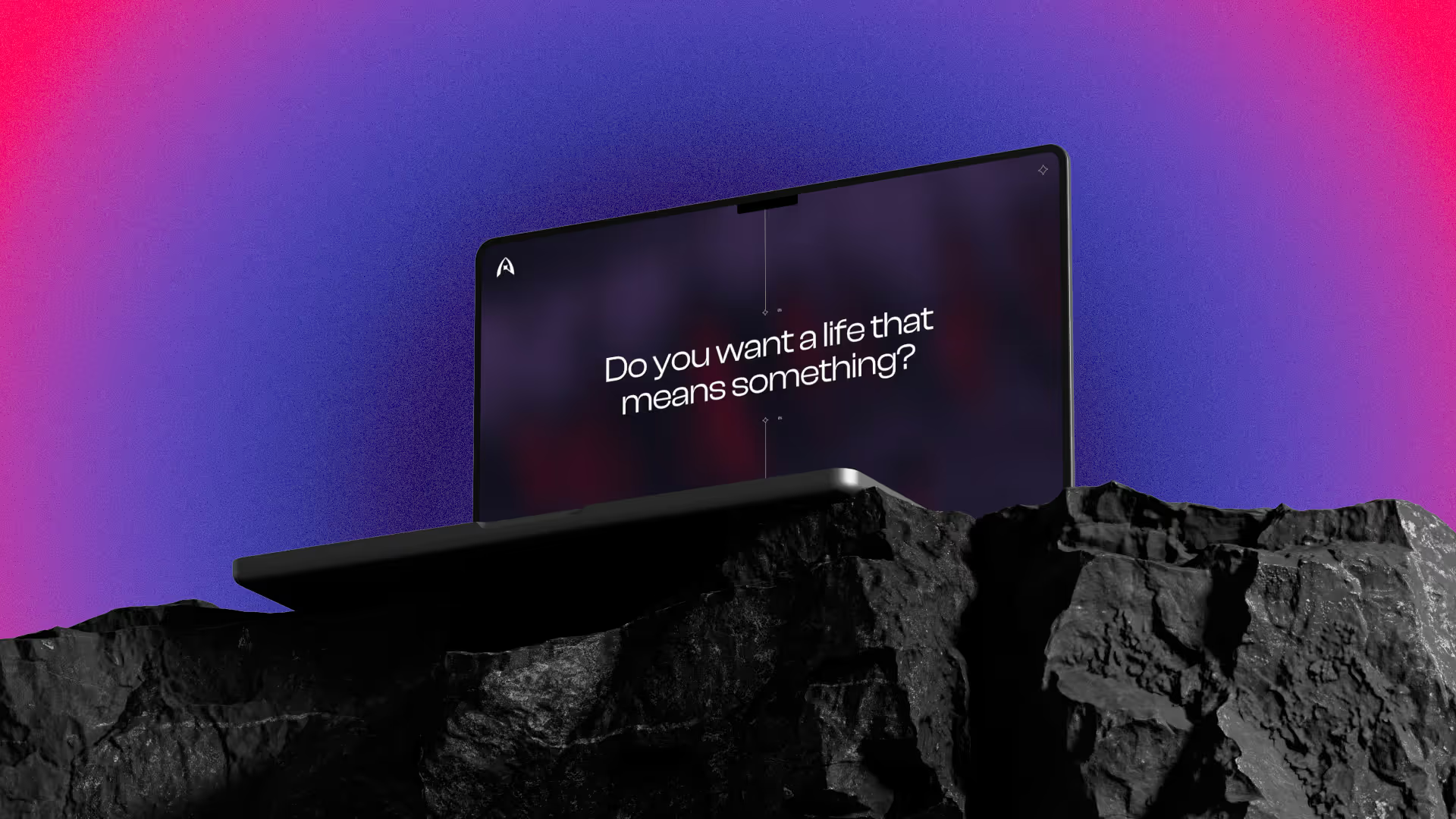
I knew Aspen Search was very different to your typical recruitment firms from me and Bens first calls. The way Ben spoke about his industry was from a place of passion. Therefor I wanted to get very clear on who Aspen exists for, this makes creative SO much easier, otherwise we’re just sailing in the dark. Thus I hosted a 3 hour workshop to flesh out Aspens positioning, personality, mission & more.

Firstly, what’s the purpose?

Is it to make a boat load of cash for the recruiters in Aspen? No

Is it to make your clients think your the best recruitment firm? Kind of

Is it to change the candidates lives by landing them in positions where they belong truly? YES YES YES!

Okay cool, so we got very clear on that. A lot of recruitment companies talk about how they’re the best, and they have the best relationships with their clients. But it’s different for Aspen. Aspen understands that without the candidates, recruitment wouldn’t even be an industry. It’s the candidates that make the wheels go round. A great placement benefits the client, but it can truly change the candidates life if placed right.

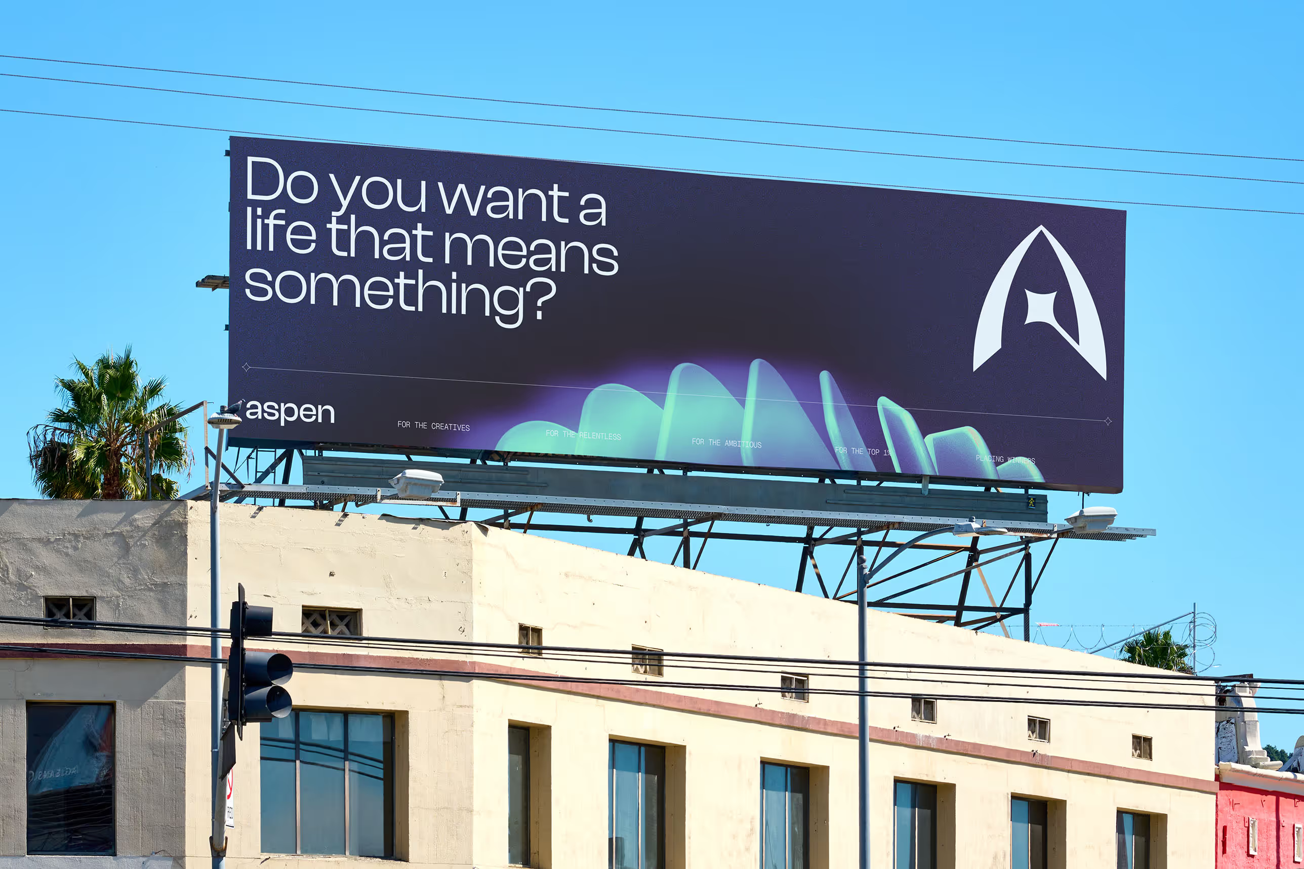
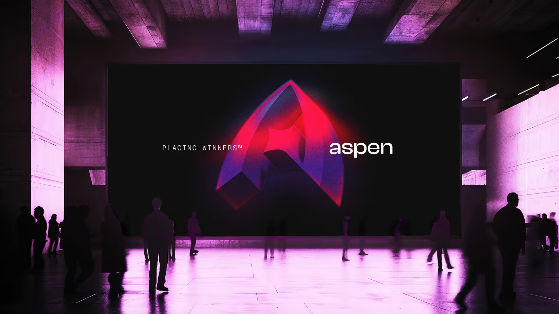
The reason Ben does recruitment is to work with the best in the game. To work alongside game changers, who want to make a life for themselves. Aspen gets to help them do that. This whole idea shaped the brand; it’s visuals, it’s messaging; it’s tone of voice etc… We even came up with the tagline — Placing Winners.

Brand Strategy

No items found.

Testimonial

No items found.
(
)

No items found.

Testimonial

No items found.
(
03
)

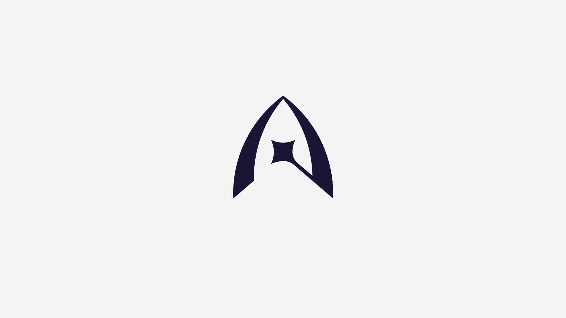
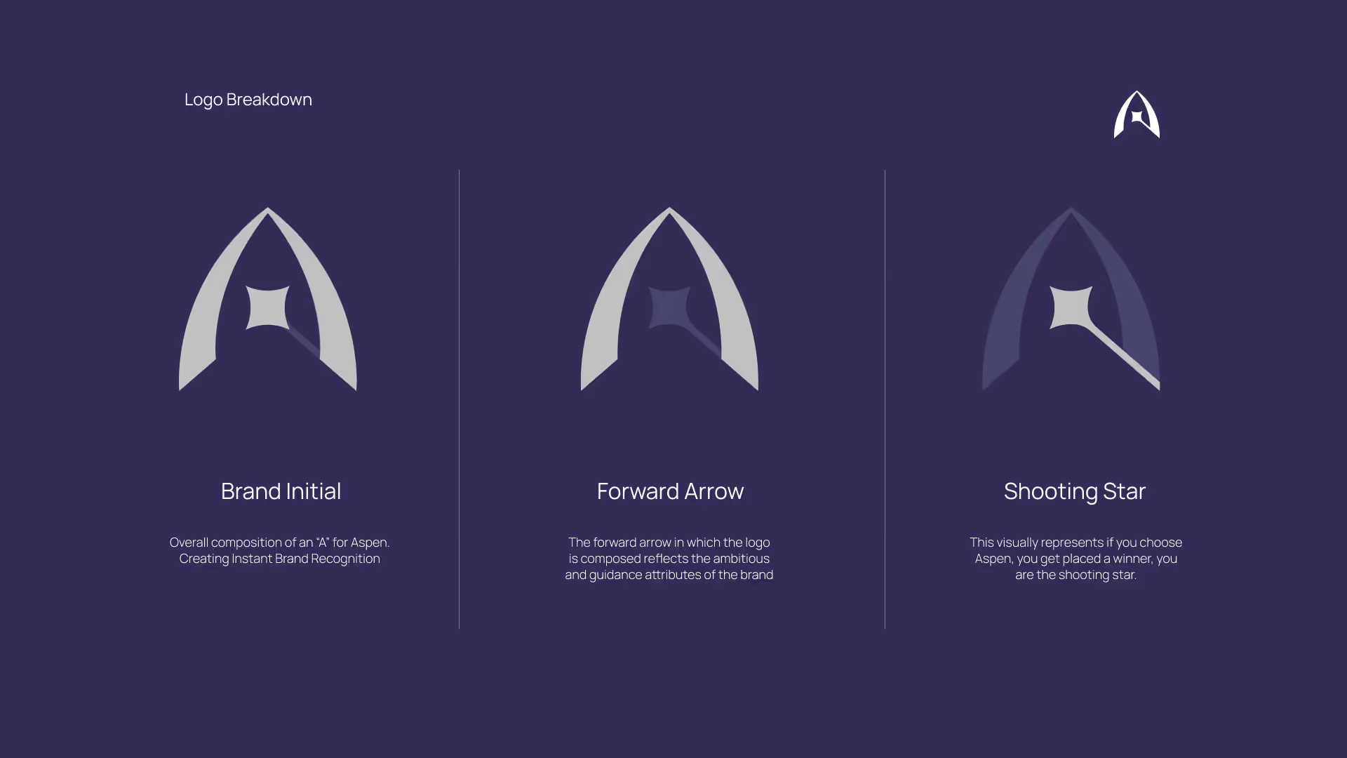
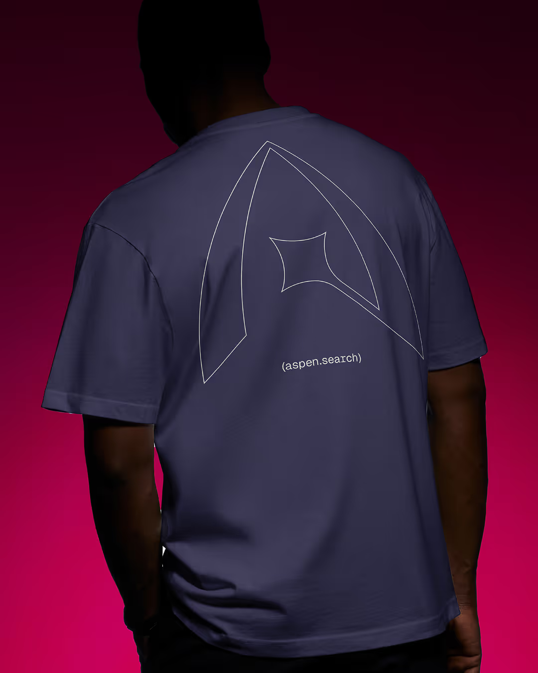
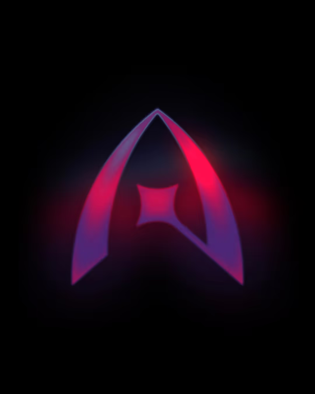
I knew the composition had to represent an A for Aspen, instant brand recognition and all that. But it had to feel powerful more than anything. A symbol of momentum & ambition. The forward motion is achieved by the arrow like shape to represent guidance which Aspen provides as a recruiter. The main juice of the logo is the shooting star shape which perfectly outlines it’s mission, to place winners.

A symbol of momentum & ambition

No items found.

Testimonial

No items found.
(
)

No items found.

Testimonial

No items found.
(
)

No items found.

Testimonial

No items found.
(
04
)

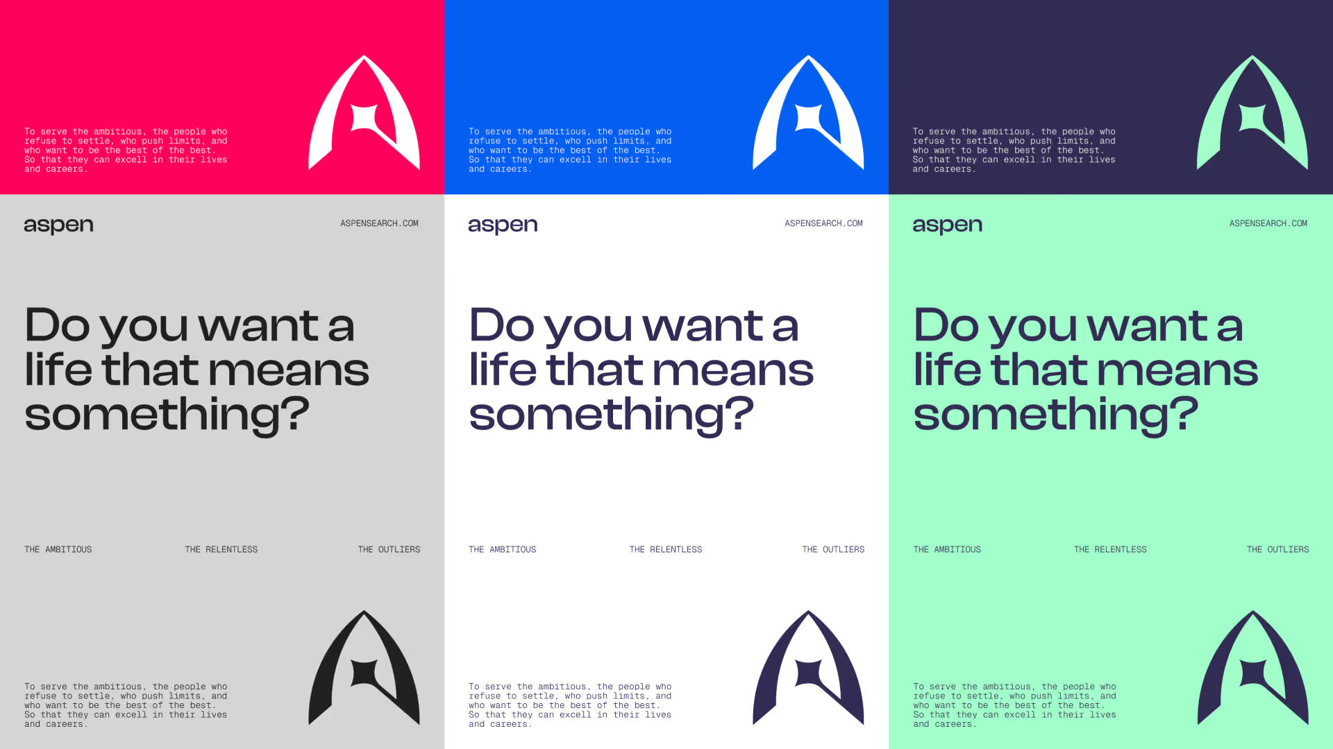
Before I got into creative I did a broad sweep of other recruitment firms and similair brands to see which colours where being primarily hoarded. It turns out, as I expected, mainly corporate blues, greys & some greens.

I really wanted Aspen to have a good range of colour. It’s very easy to fall into the monochrome camp with one colour for accents and what not, but I really wanted something that turned heads.

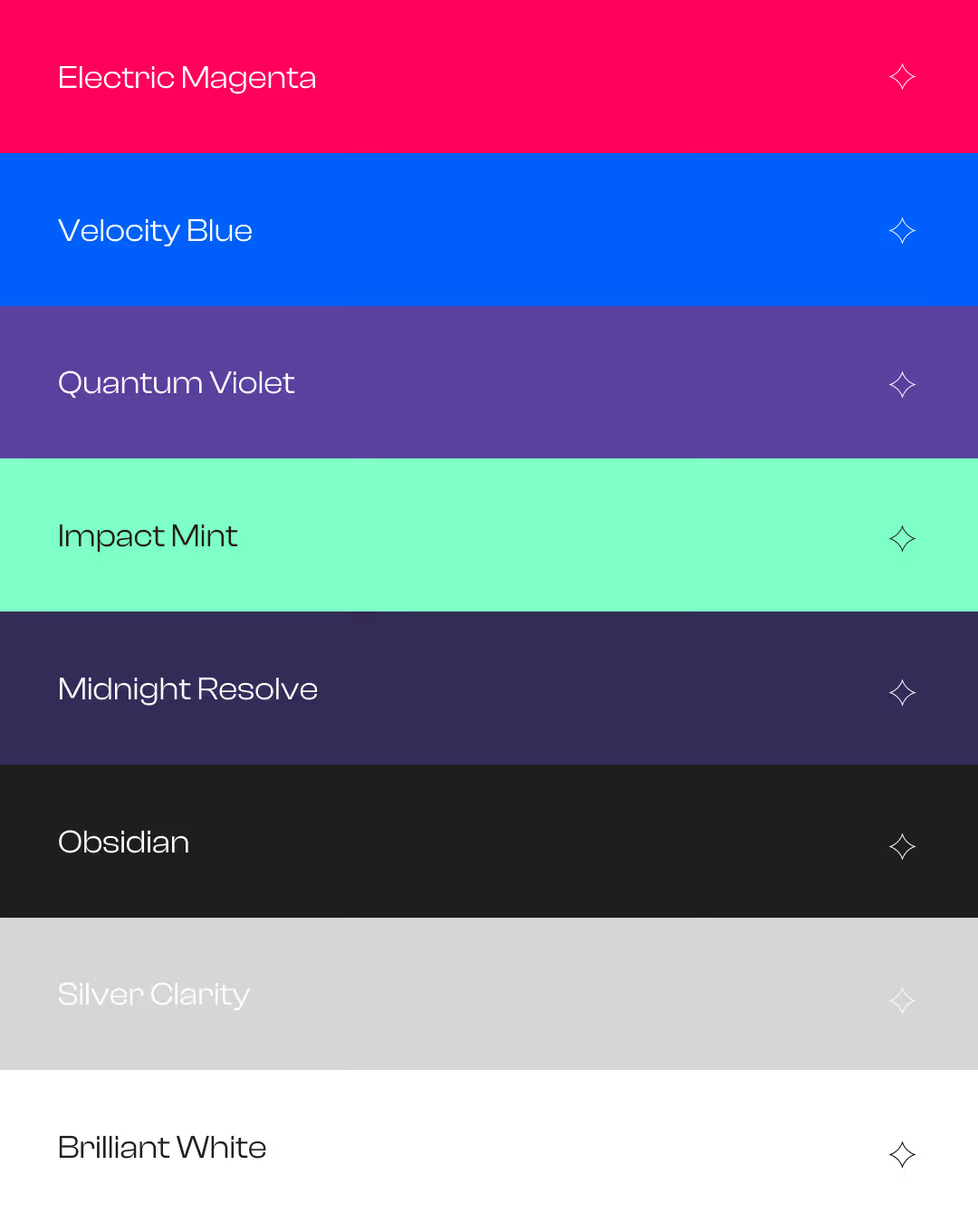
I started with the Electric Magenta as the first primary colour. From here I contrasted it with the Velocity blue. I wanted this sharp contrast between two primary colours. The blue only shows up about 10% of the time throughout the branding to stop us blending in with Aspens competitors.

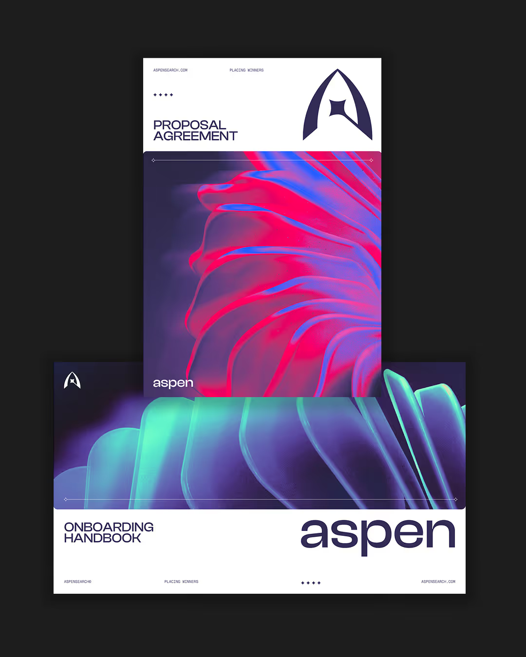
Logically, for the next wave of colour — What happens when you mix Red & Blue? you get purple. I used two shades, quantum violet and midnight resolve. The over-arching reason for this colour palette was I knew I’d be creating 3D renders that would be used across the brand. And I knew these colours would be perfect. Paired with a few shades of grey and brilliant white you get this fantastic bold colour palette that really sets Aspen apart from the rest of the industry.

Colour

No items found.

Testimonial

No items found.
(
)

No items found.

Testimonial

No items found.
(
)

No items found.

Testimonial

No items found.
(
)

No items found.

Testimonial

No items found.
(
)

No items found.

Testimonial

No items found.
(
)

No items found.

Testimonial

Ben Herman
Founder of Aspen Search

Thank you Frankie, the last few months have been a journey. I'm so excited to share this with the world and the industry I've spent 20 years working within. Every recruiting firm looks and feels the same, our approach was how do we truly stand out and do something completely different.

No items found.

More Projects(2)

View all