Cart(0)
0

Cetera is a private invite only platform that helps people navigate major life transitions. Users get an AI personalised plan that breaks down what needs to happen next, a private update feed to keep their close friends and family informed, and a support registry so the people in their life have a clear way to show up and help. One place, instead of four.

Cetera

Year

2026

Services

Logo Design
Visual Identity
Brand Style Guide

Cetera is a private invite only platform that helps people navigate major life transitions. Users get an AI personalised plan that breaks down what needs to happen next, a private update feed to keep their close friends and family informed, and a support registry so the people in their life have a clear way to show up and help. One place, instead of four.

Credits

Designer
Frankie Harry
(
)

No items found.

Testimonial

No items found.
(
01
)

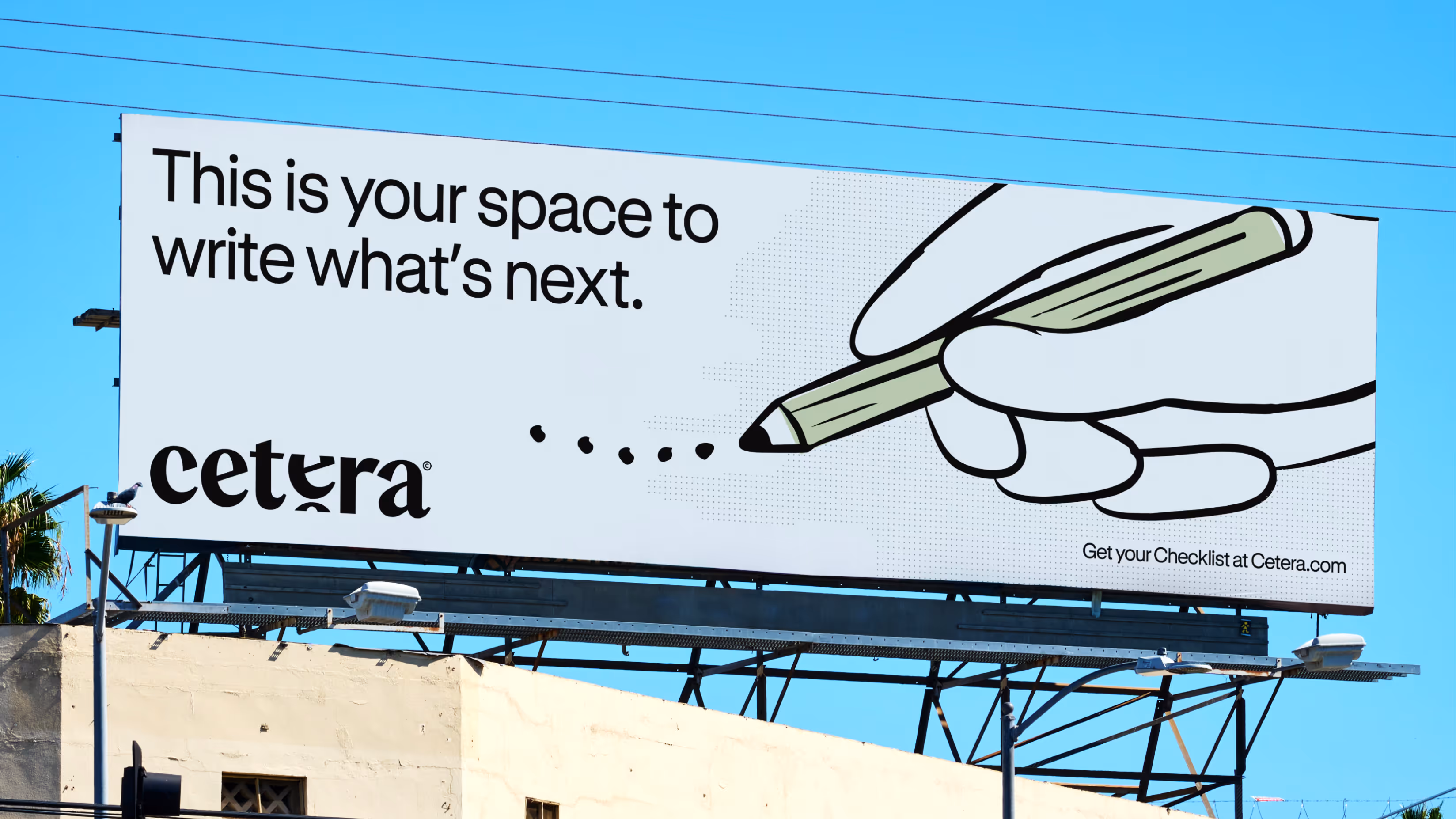
Cetera aims to be the place people turn to when life changes in a way no one planned for. The problem is that nothing like this exists today. The current landscape is fragmented. You have legal platforms that handle paperwork, crowdfunding tools that require going public, care coordination apps built around illness, and wedding registries designed for celebration. Each solves one small piece of the puzzle, but none of them address the full human experience of navigating a major life change. People are left stitching together group chats, spreadsheets, Amazon wishlists, and Venmo requests while simultaneously trying to hold their lives together. The gap between the chaos people are living through and the tools available to them is exactly where Cetera lives. It's a category that doesn't yet have a name, which means there's a genuine white space here for Cetera to define and own.

Challenge

No items found.

Testimonial

No items found.
(
)

No items found.

Testimonial

No items found.
(
02
)

We came up with the brands north star as "Your space to write what's next" which gave us a clear goal of how the identity needed to make people feel. Cutting through the landscape of therapy coded visuals and messaging. We crafted an identity that made its users feel capable and strong, while give the secondary audience (the support) an easy way to show up.

Strategy

No items found.

Testimonial

No items found.
(
)

No items found.

Testimonial

No items found.
(
)

No items found.

Testimonial

No items found.
(
)

No items found.

Testimonial

No items found.
(
03
)

We created a beautiful wordmark that visualises the transition of chapters and brought it to life through animation. This language carries over to the way photography is housed, leaking off the page. We crafted hand drawn illustrations that feel human and supportive. Patterns that reference the ellipsis. Everything points back to the continuation of a story. Nothing is fixed or static. The Result: a brand that empowers its users to feel capable and strong regardless of the situation they're going through.

Identity

No items found.

Testimonial

No items found.
(
)

No items found.

Testimonial

No items found.
(
)

No items found.

Testimonial

No items found.
(
)

No items found.

Testimonial

No items found.
(
04
)

The brand can clearly communicate it's positioning as an all in one life event OS, completely unique from the offerings within its industry. We equipped the brand with an easy to roll out brand guidelines as it starts development of it's MVP, focusing on Divorce. We cannot wait to see the impact this brand has with consumers as it develops over the next few years. Watch this space!

Outcome

No items found.

Testimonial

No items found.
(
)

No items found.

Testimonial

No items found.
(
)

No items found.

Testimonial

No items found.
(
)

No items found.

Testimonial

No items found.

More Projects(2)

View all