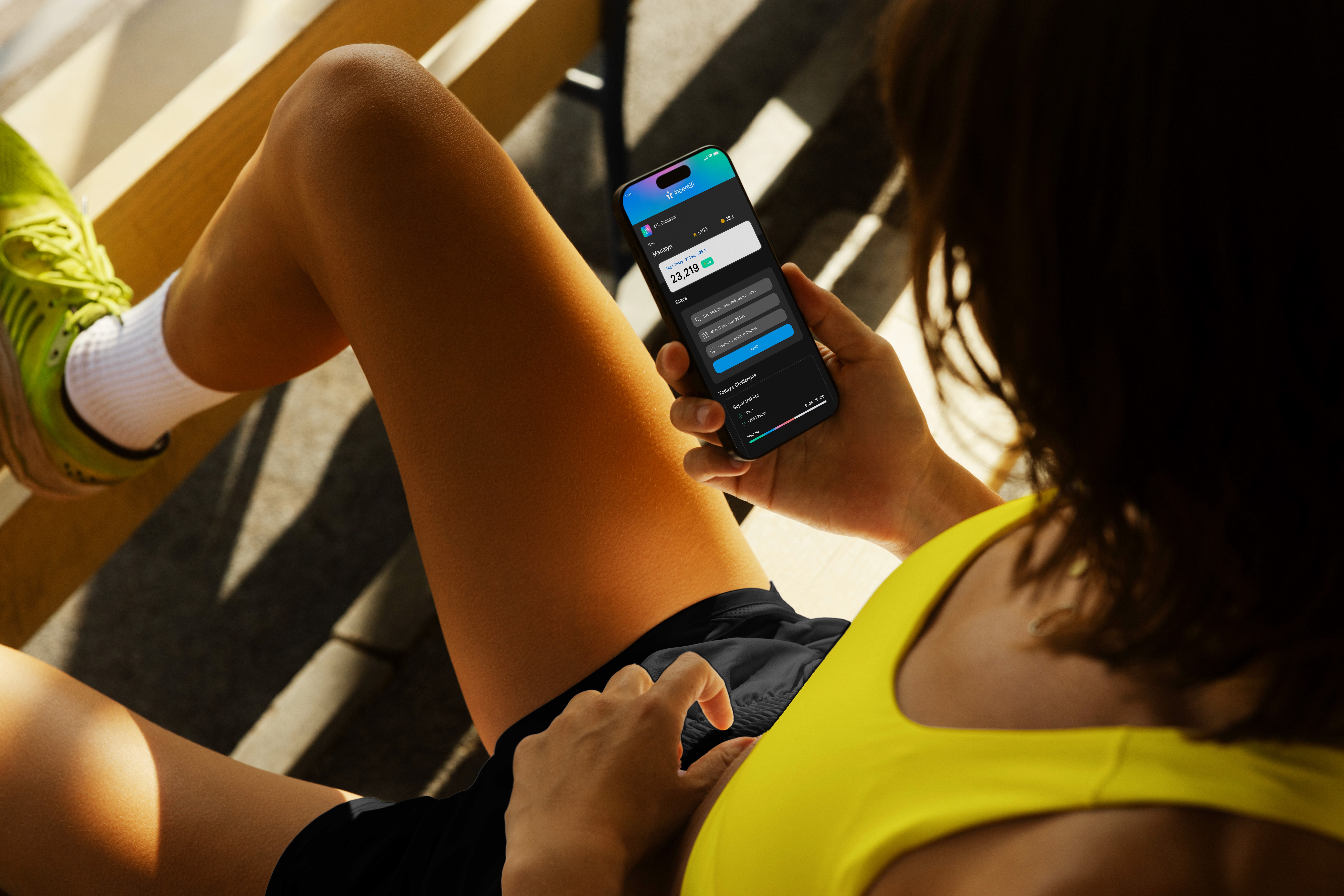
I had the absolute pleasure of working on incentifi's brand identity with Paul Kelbie & James Madders: the Co-Founders. This being a brand that's right up my street being in the health and wellness field, I knew I was going to have a good time with this one. incentifi is a new app that sits at the intersection of Wellness, Rewards & Travel. Rewarding employees of companies to log fitness and wellness activities in return for high value incentives such as travel discounts.
The Health and Wellness space is pretty crowded but incentifi's unique approach to the industry offering high value travel incentives meant we really needed to figure a way to stand out.
Brand Strategy
Setting the project up for success.
To kick the project off me and Paul got into a Brand Strategy workshop. This is so I could find out as much as possible about the brand: It's positioning in the market, who the brands speaking to, and it's ultimate vision.
With all this information I went away and started to curate incentifi's verbal identity. How the brand speaks, how it's audience feels when interacting with the brand and how it shows up at every touchpoint. This allowed me to go into designing its visual identity with full confidence. I put together a creative brief that served as my north star and away I went.
The information collated here was then put into the final brand book at the end of the project as seen above.
The Logo
The Face of the Brand
When designing the logo. Simplicity was key. I played around with a few concepts of where this could go. Ultimately when I came onto the chosen concept I knew this was the one to go forward with simply because it represented the brand best. No others I came up with even came close.
By combing a Star (rewards) and an i (brand initial). The i carves out negative space right down the middle of the star which formed the composition of a figure doing a star jump which perfectly represents the healthy habits of the brand.
So we have a Star for Rewards. i for the brand Initial and a figure jumping for movement. Representing Incentifi.
Tagline
Simple & Effective.
Paul and I decided we needed to come up with a tagline for the brand that quickly described what the business does at a glance due to the brand sitting in three different industries.
We came up with:
Rewarding Wellness, Inspiring with Travel.
This is ultimately the purpose of the brand summed up into 5 words. The tagline will appear selectively on adverts and in a version of the logo where the brand is not well known.
Typography
Clean & Minimal.
I chose the lovely typeface General Sans as incentifi's primary typeface. I chose it for its minimalist feel. The tone of voice of the brand needed a clear and trustworthy typeface to visualise it's messaging. I love the italic versions of the typeface which we use to highlight key words in sentances and dynamic text layouts which adds a bit of energy to the type system.
Colour Palette
The Tricky Part.
Choosing the colour palette for incentifi was tricky. I was trying to pick a colour palette that incentifi could own. Looking at the colour space in the wellness industry; Lot's of brands where using colours like, red, burgundy & dark blues. So we knew to stay away from those.
While working on the brand I personally felt that incentifi was so much more than just one colour and I remembered something that came up in one of our early calls that stuck with me. And that was that the brand sits at this intersection of wellness, rewards and travel. Paul also wanted to emphasise the journey a user takes will using the app.
It then came to me to use a gradient colour palette for the brand, merging three colours that represent each sector the brand is in. The 3 primary colours merged represents the brands positioning within the industry. And the palette is also a lovely nod to journey a user takes while using the platform.
A truly ownable colour palette for incentifi.
Testimonial
Testimonial
Frankie and I had been following each other for a while on Instagram before we'd discussed any business discussions. I'd been down a Rabbit hole with his content and it was great. When it was time for us to focus on our brands direction there was only 1 person I was going to. I knew that once we'd had our initial call that Frankie would deliver the goods… and he did, no joke, first time. Genuinly loved working with Frankie
Paul Kelbie - Co Founder.


