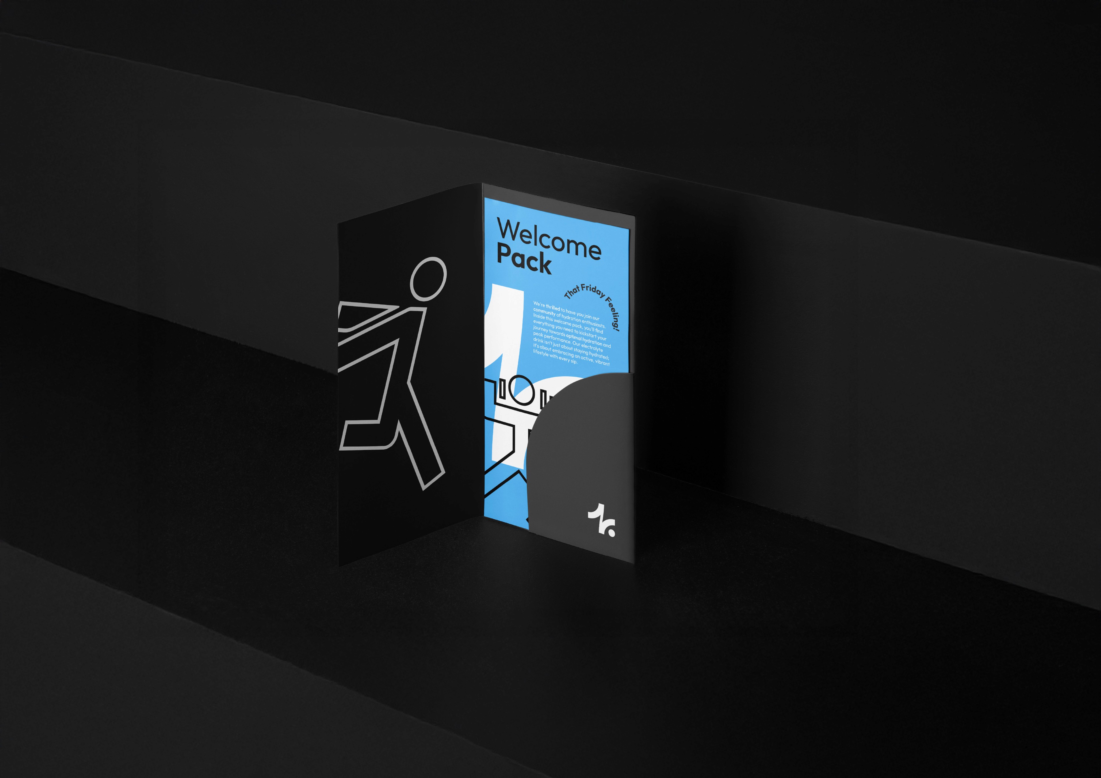
Friday has a commitment to providing energy, removing brain fog, and replenishing essential nutrients with their core product, and electrolyte and vitamin drink mix. They understand the profound impact that hydration and proper nutrition have on physical and mental performance, which is why they've meticulously crafted a specially selected electrolyte formula to fight fatigue and brain fog, allowing the everyday person to live an optimal life.
Driven by their core values of diversity, trust and community, they aim to educate and motivate their customers, guiding them on their journey towards a healthier, more vibrant life. The founders combine the expertise of Max, a seasoned personal trainer, and Faisal, a knowledgeable pharmacist, ensuring that their products are backed by the latest science and tailored to meet the diverse needs of their audience.
Both Faisal and Max came to me needing a Logo Design & Visual Identity to kickstart their mission.
Client:
Friday
Designer:
Frankie Harry
Year:
2024
Service Provided:
Brand Naming, Logo Design, Visual Identity, Packaging Design
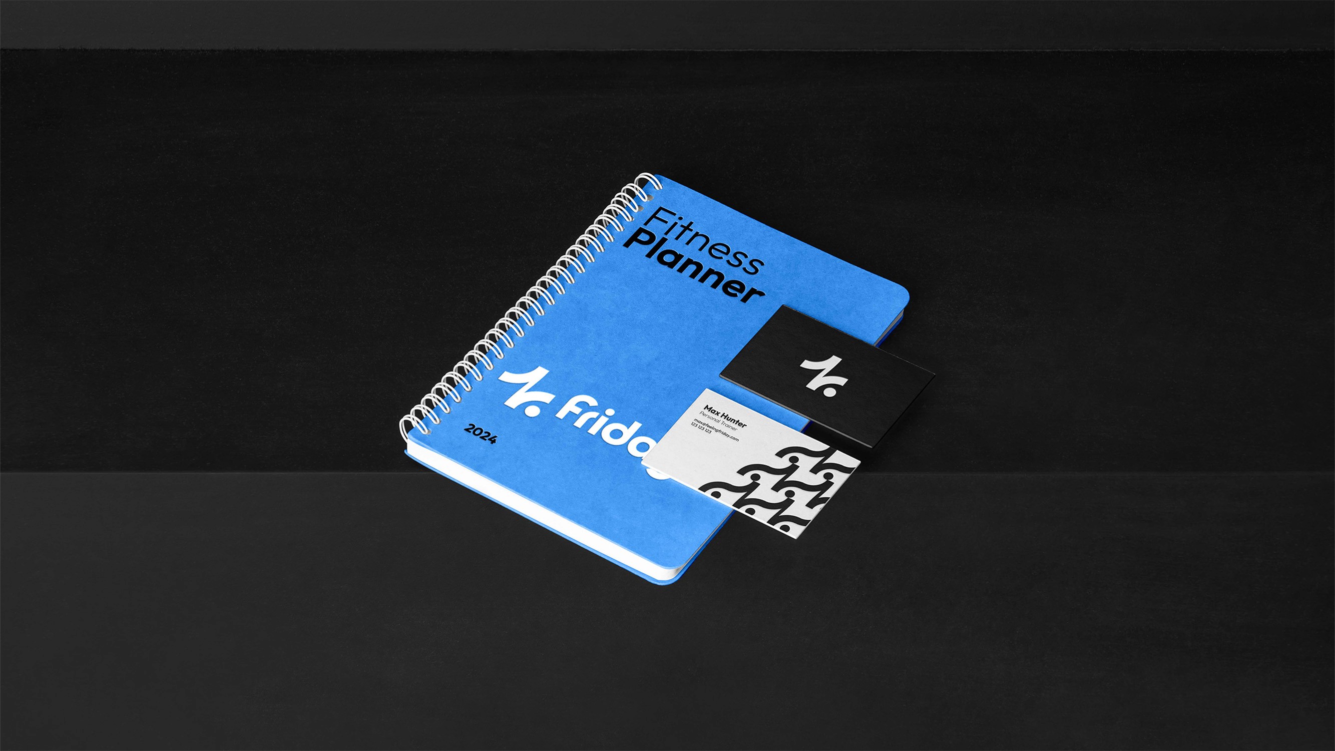
The Logo


The logomark concept is built from three key elements. The Plus Sign which represents electrolytes in the product and promotes positivity. The Stickman Cartwheel symbolises joy, energy and movement, aligning with the brands active culture. Finally The Waterdroplets in the negative space which reinforce the brands hydration misision.
The logotype is a custom design incorporating quarter-circle elements from the logomark into the ‘F’ and ‘Y’ for a beautifully balance logotype. It’s design is friendly and approachable rather than overly sporty, making it appeal to everyday individuals.
Typography & Colours


For the Colour Palette, we chose a sleek combination of black, white, and light grey. Black reflects the brand’s professional and empowering qualities, aiming to inspire its audience toward a healthier lifestyle. White embodies the fresh, trustworthy side of the brand, which is essential for a company focused on health supplements. Together, these two tones give a modern, clean look.
To add a layer of personality, we introduced vibrant accents: blue, hot pink, green, and orange. These colours convey the brand’s playful side, showing that while it’s clean and professional, it also embraces energy and fun.
For typography, we opted for the typeface Outfit, which offers a range of elegant styles. The letterforms in Outfit reflect elements of the custom logotype, giving the brand a cohesive look. It’s easy to read and carries a welcoming, modern feel that aligns perfectly with the brand’s character.
Brand Icons
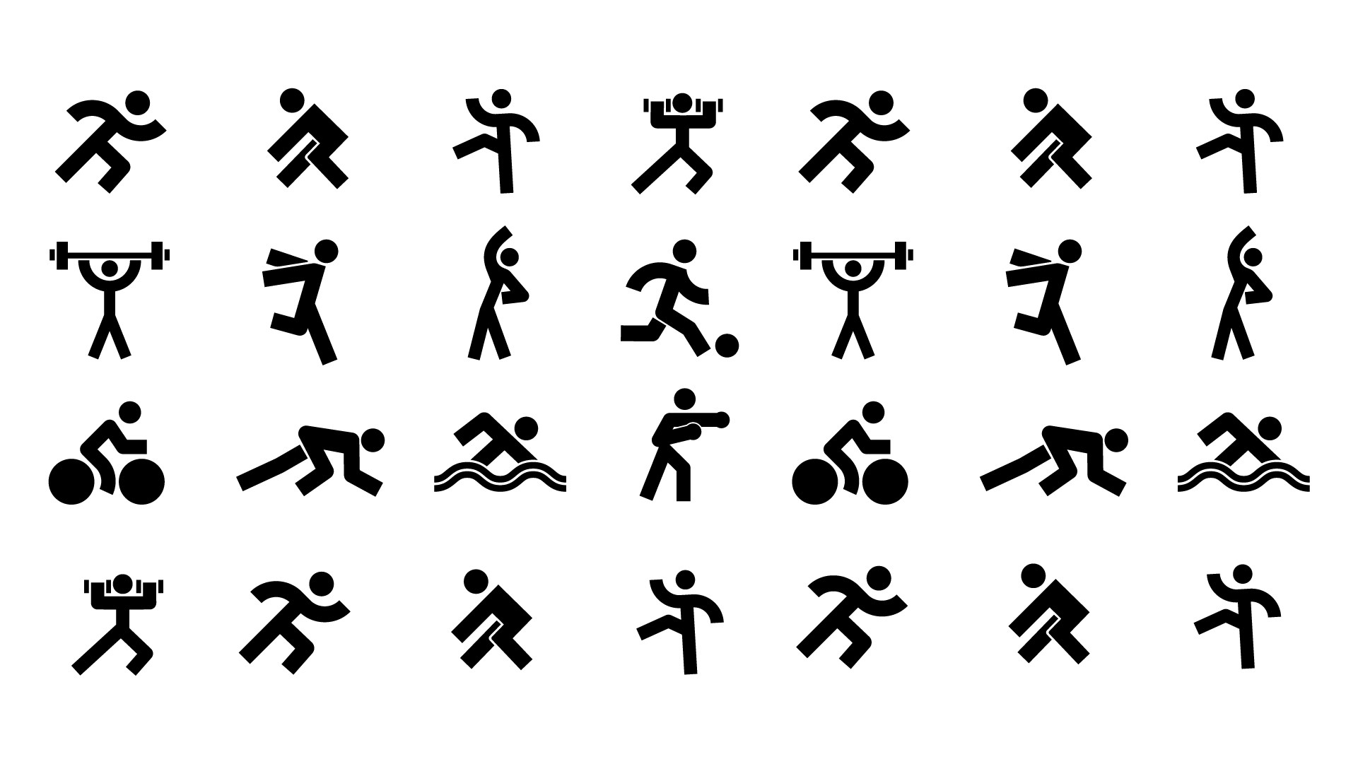
We created these stickmen icons for the brand to easily visualise the sports in which the product is aimed to aid. These will work so well for creating marketing materials, graphic elements, packaging and UI decoration. They also visually tie in with the brands symbol, creating them with the same line weight and circles.
Packaging Design
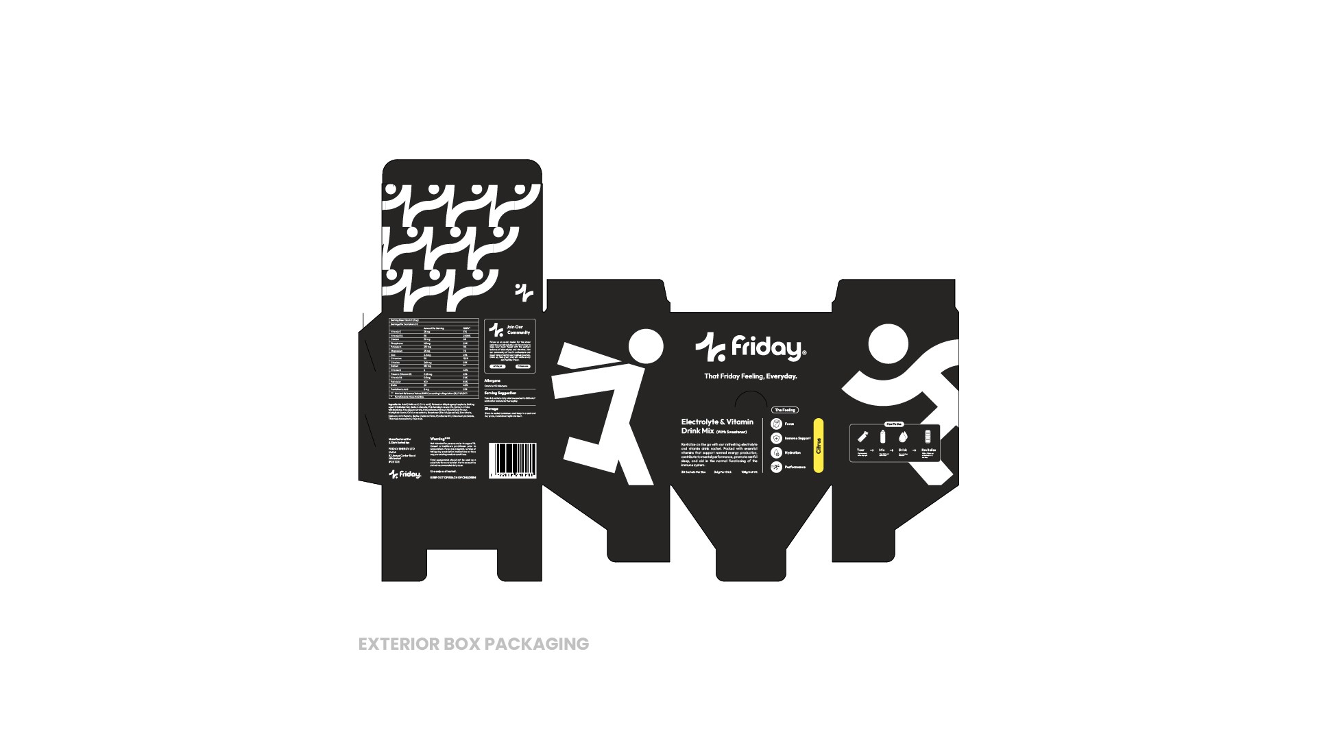
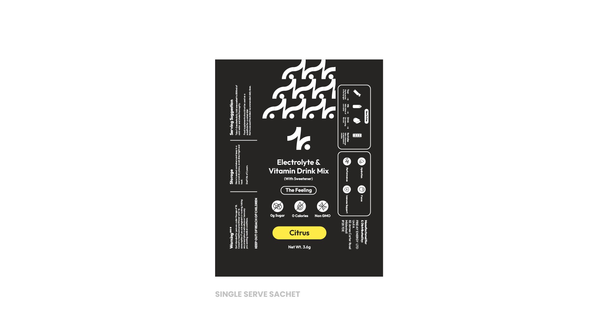
We was tasked with designing the packaging for the first product run, focusing on a clean, modern, and trustworthy look that aligns with the brand’s values. To achieve this, I used the brand’s iconic symbols in a bold, enlarged format along the side panels of the packaging. This approach brings a sense of dynamism and visual interest, turning the packaging into more than just functional wrapping; it becomes a brand experience in itself.
The enlarged icons add movement and energy to the design, breaking up large areas of text and creating a more engaging and visually balanced layout. On both the sachets and the exterior box, the design feels fresh and minimal yet still rich in detail, capturing the brand's modern and approachable feel. The result is packaging that feels both inviting and credible, encouraging customers to trust the product from the first glance.